Case 01 Branding · Visual system · Physical space

Bhassa Toyota

Modernizing a brand with almost four decades in the city — without losing the symbol that made it recognizable.

Institutional flags with the redrawn Bhassa logotype in light and dark versions
Client
Bhassa — Official Toyota dealership
La Pampa · Buenos Aires
Role
Creative and brand direction
Production coordination · at pastafro.la
Period
2015 — 2024
Rebranding 2022
Scope
3 branches · 3 cities
360 system, physical + digital
01
Problem

Bhassa is the face of Toyota in the center of the country: three dealerships in three cities. They had something almost no client has — a beloved, inherited symbol, recognized by the whole community.

And for that very reason, they didn't want to touch anything. For years, a rebrand was off the table: the risk of losing hard-won recognition outweighed the need to update. The problem wasn't an ugly brand. It was a brand falling behind in the digital era and afraid to move.
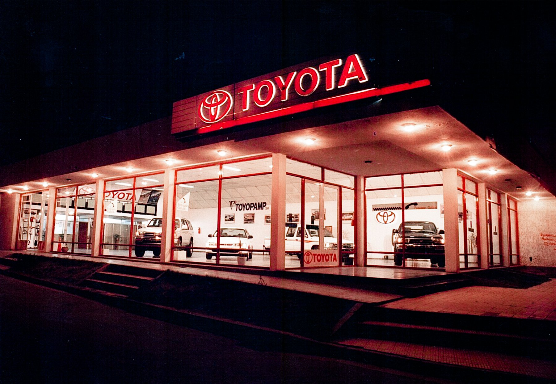
Night façade of the Santa Rosa branch with the ToyoPamp sign
The Santa Rosa branch with the inherited brand. The ToyoPamp isologotype had been part of the city's landscape long before anyone asked for a rebrand.
02
Creative tension

We weren't hired to rebrand. We came in in 2015 as content creators, and it took us five years of trust to reach the point where the client was willing to listen.

The opportunity came with the opening of a new branch. But it came with a non-negotiable condition: the shape of the isologotype is not touched. That silhouette —the combination of the T and the P of ToyoPamp— was a family inheritance, not a design decision.

That was the real challenge. Not discarding the symbol, but redrawing its lines: modernizing the stroke, refining the geometry and giving it back its relevance without anyone in the city ceasing to recognize it. Respect the shape in order to change everything else.

Before — inherited silhouette

A single flat color, lowercase initials and a stroke designed for 1990s printed signage. Recognizable in the city, illegible on a small screen.

After — redrawn lines

The same silhouette, with refined geometry, two tones, capitals and a 9° slant. Nobody in the city stopped recognizing it.
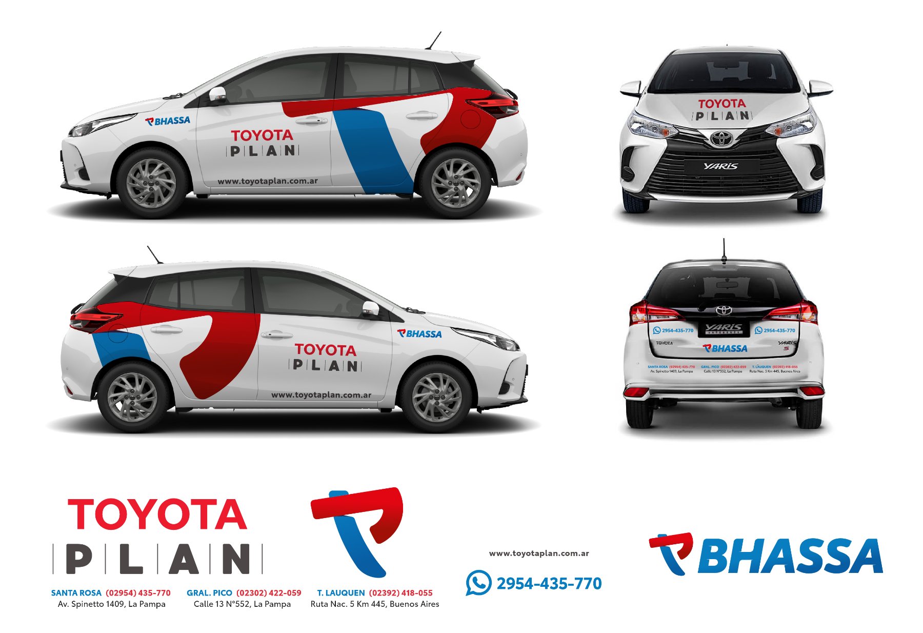
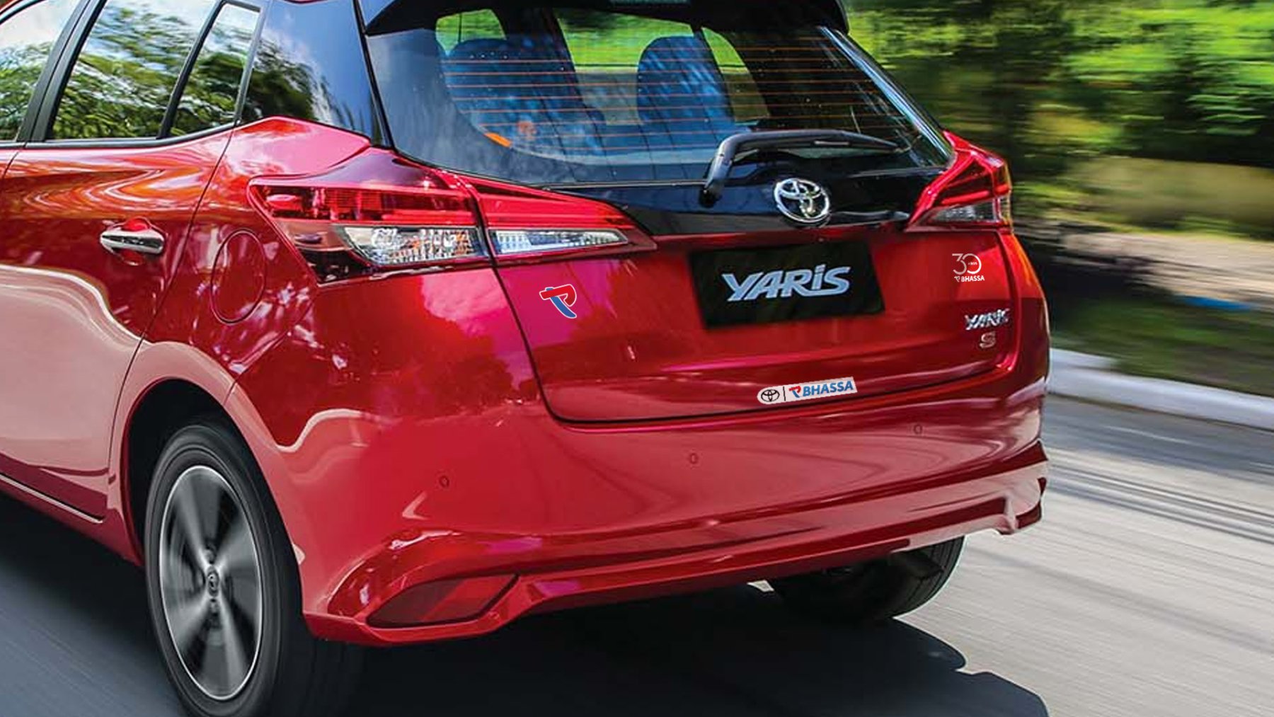
Wrap sheet with four views of the Yaris and the redrawn logotype
The inherited silhouette is still there, with refined geometry and two tones. Here, applied to the Plan de Ahorro fleet next to the Toyota ISO.
The core of the system
Concept

Always forward.

Freshness, dynamism and movement — without breaking with what the city already recognized. A renewal that evolves the essence instead of erasing it.

The isologotype, redrawn
TP initials kept — from ToyoPamp, set in capitals to gain presence.
Two tones where there used to be one — a distinctive trait of its own.
9° slant, rounded corners and a detail that echoes the ISO: movement.
Built on Toyota Type Black Italic.
Color
Bhassa Blue
#087DBE
Process Blue C
Bhassa Red
#E00613
Pantone 485 C
Deep
#040319
Solid backgrounds
White
#FFFFFF
Breathing room
Gradients — 087DBE → 085DA1 · E00613 → A11007
Typography
Aa Montserrat · web

Regular · Medium · Semibold · Bold.
The digital voice of the system.

Toyota Type — headlines and communication, and the base of the logotype (Black Italic, 9°).
Coexistence
Toyota ISO

Bhassa is not a brand that lives alone: it coexists with Toyota's global ISO in every application. The system defines safety spaces and hierarchies so that its own identity can breathe without stepping on —or being stepped on by— the corporate brand.

03
System

What began as content ended up being a 360 creative agency. We built the complete visual ecosystem —physical and digital— replicated across three cities.

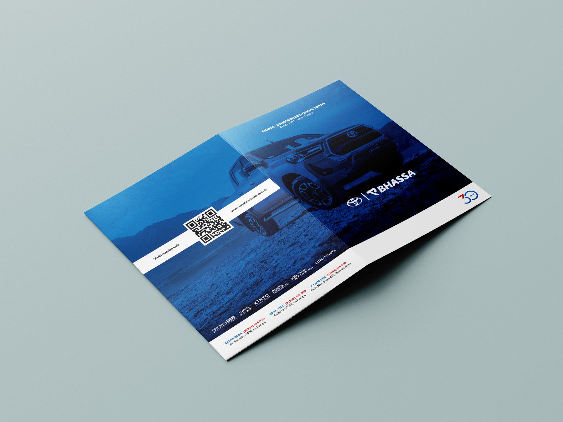
Bhassa institutional diptych open on a gray background
Institutional brochure · diptych for the 30th anniversary
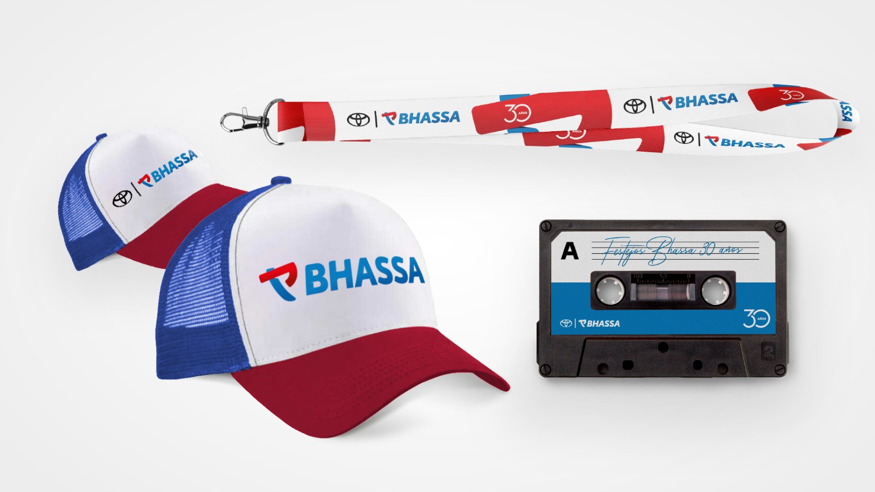
Caps, lanyard and cassette from the 30th anniversary campaign
Merchandising — caps, lanyards and campaign pieces
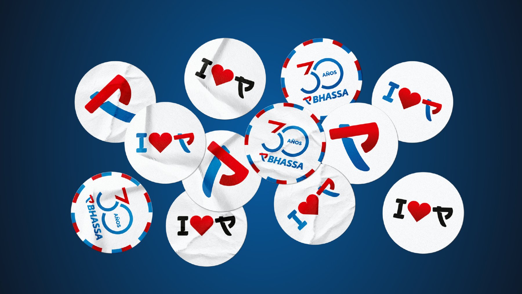
Stickers from the 30th anniversary campaign on a blue background
Stickers — the brand as a collectible object
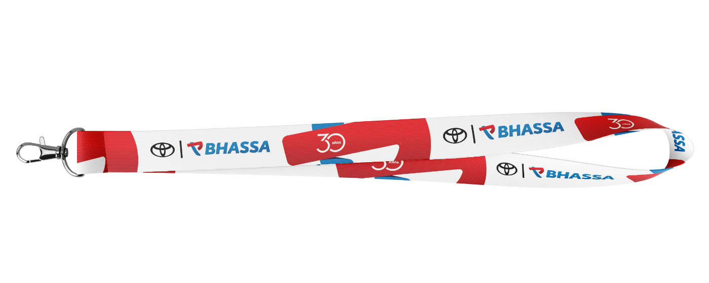
Lanyard with the Toyota Bhassa lockup and the 30-year seal
Badges and lanyards for fairs and events
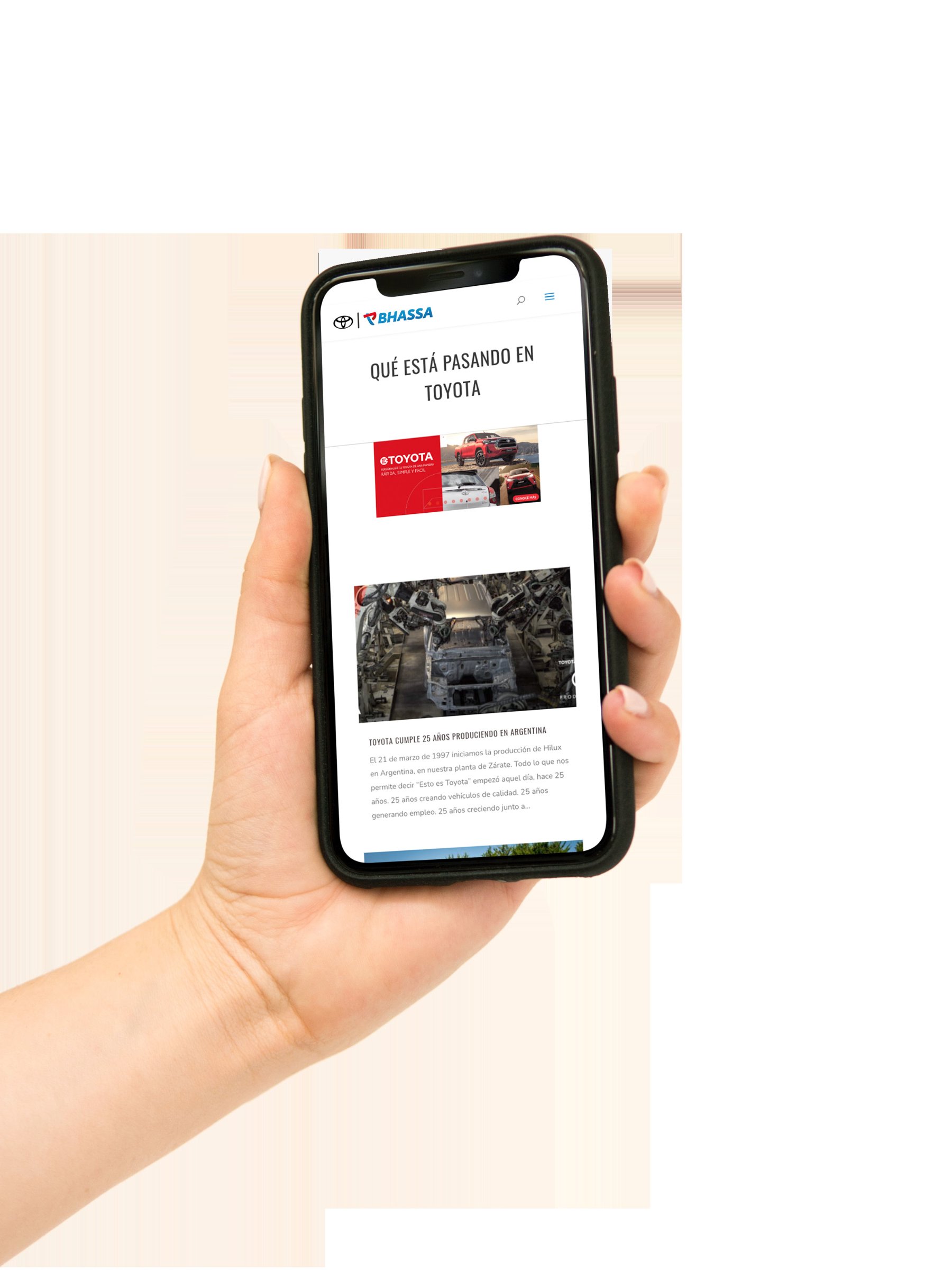
Bhassa corporate site on a phone screen
Corporate site · mobile version
Rear of a Yaris with the Bhassa and anniversary decals
Fleet decals · applied on vehicle

The corporate site was renewed until Toyota unified all dealerships under a single template. Even so, the custom developments for Used Cars and Industrial Equipment stayed alive until 2025 — outside the mold. I coordinated the external suppliers in the three cities so the system landed consistently at every point.

Before the rebrand
Trenque Lauquen branch · Route 5

It wasn't signage. It was designing an entire establishment.

I coordinated the design and fit-out of all the pieces that now make up the place: wraps, murals, decorative lighting, interior signage, full set dressing of the office area and a living green wall in the showroom.

All of this predates the rebrand: it was done with the previous identity, the one you see in these photos. It was the project that finished building the trust that, years later, made it possible to sit down and discuss the brand.
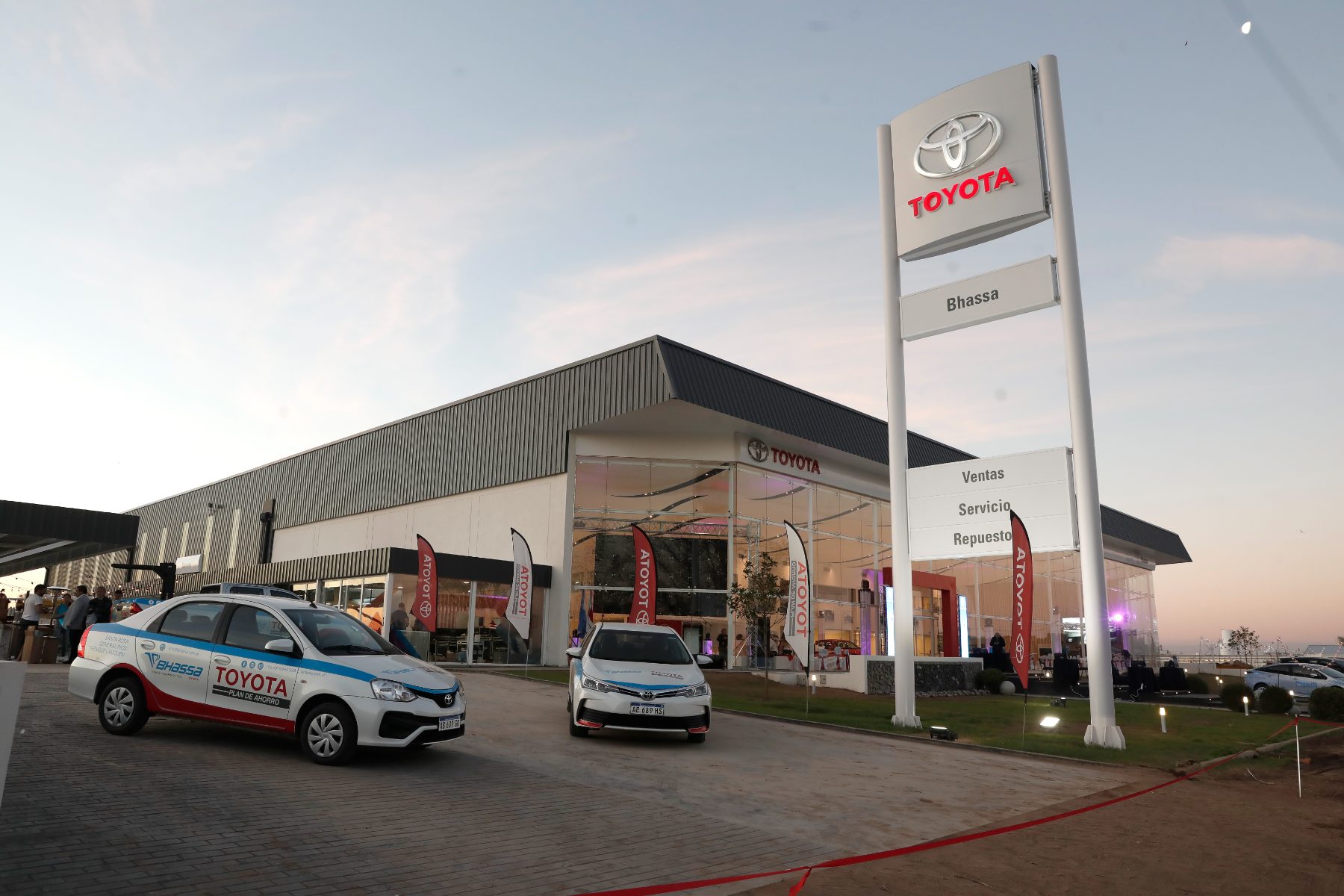
Branch at sunset on opening day, with Toyota pylon and wrapped fleet
Opening day, with the previous identity on the vehicles and on the pylon.
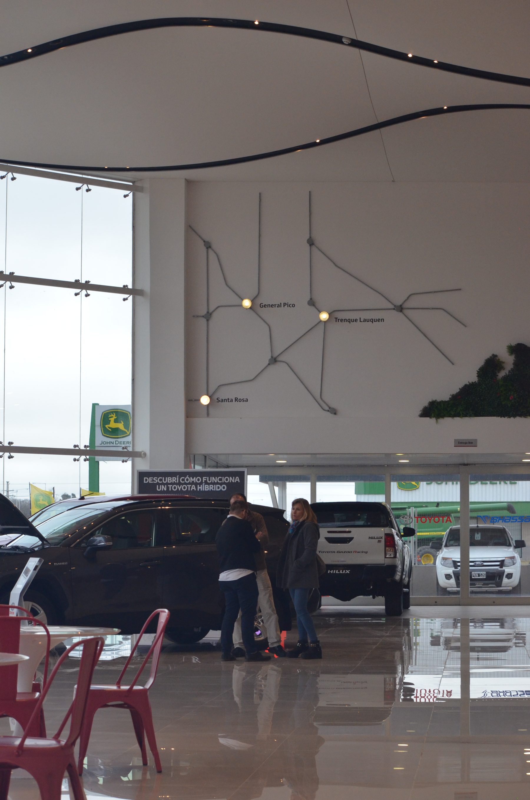
Showroom with the illuminated route map and the living green wall
The heart of the showroom: the route map linking Santa Rosa, General Pico and Trenque Lauquen, built in metal rod with points of light, and the living green wall beside it.
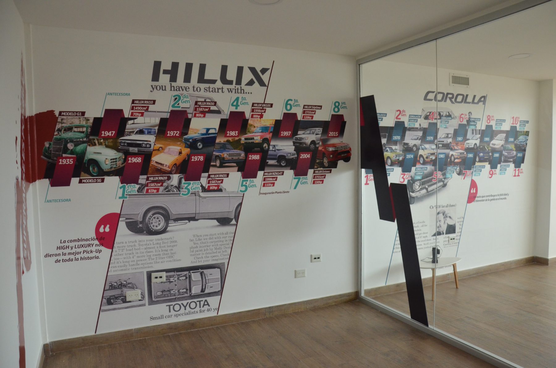
Mural with the Hilux timeline wrapped on the wall
Hilux timeline — from 1935 to 2015, wrapped on wall and glass.
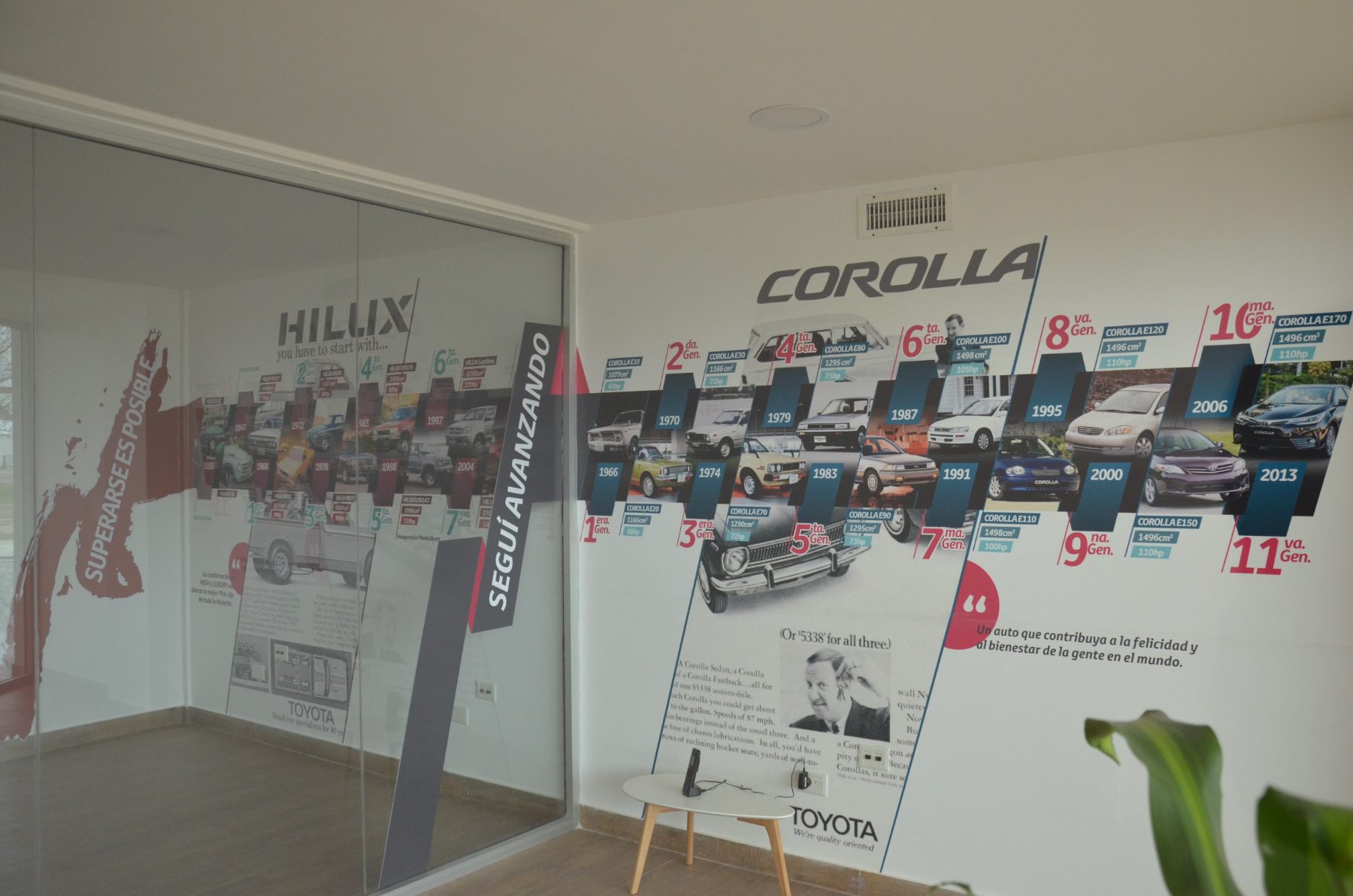
Mural with the Corolla timeline and the phrase Keep moving forward
Eleven generations of Corolla, and the glass as a second layer of the story.
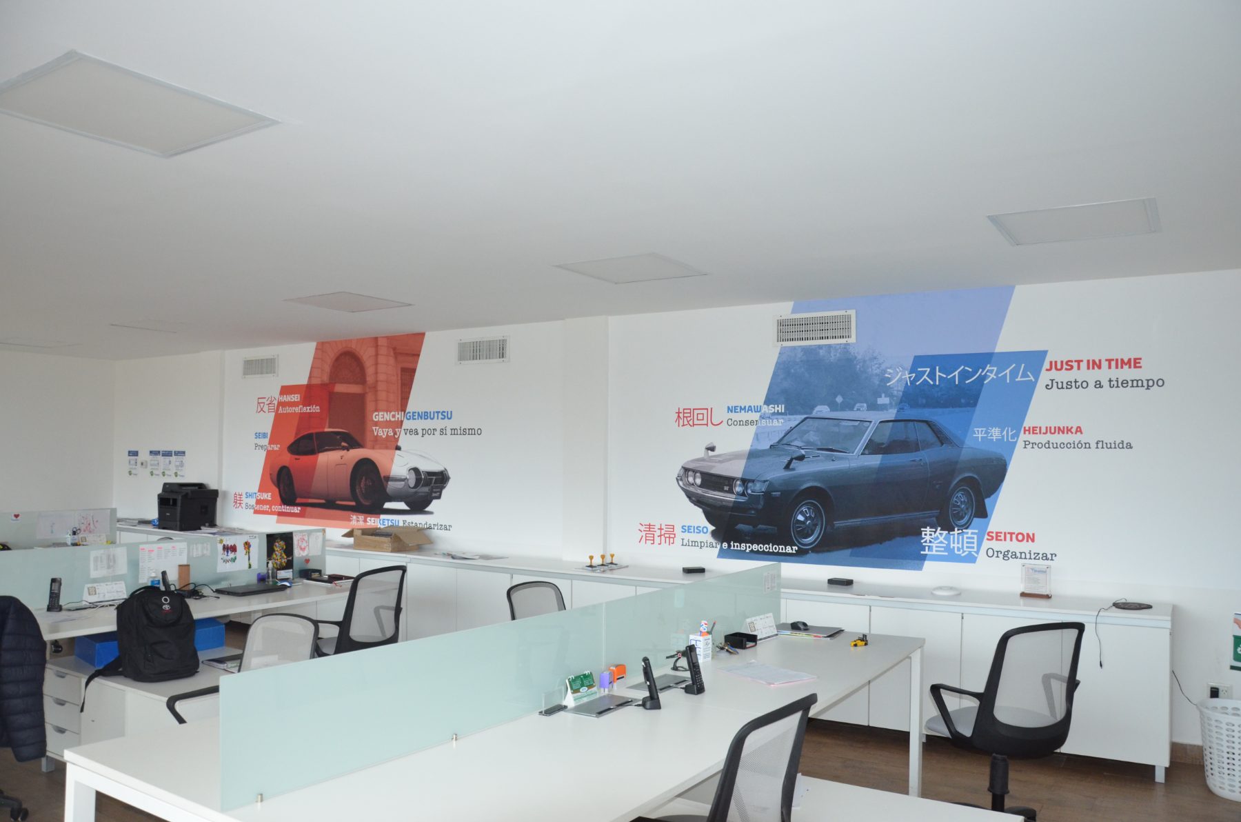
Offices with murals of the Toyota principles in Japanese and Spanish
The house principles —genchi genbutsu, just in time, heijunka— over the work area.
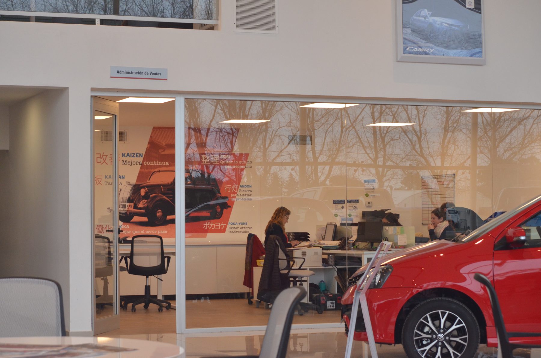
Sales administration with the Kaizen mural seen from the showroom
Kaizen in sales administration: the graphic reads from the showroom, through the glass.
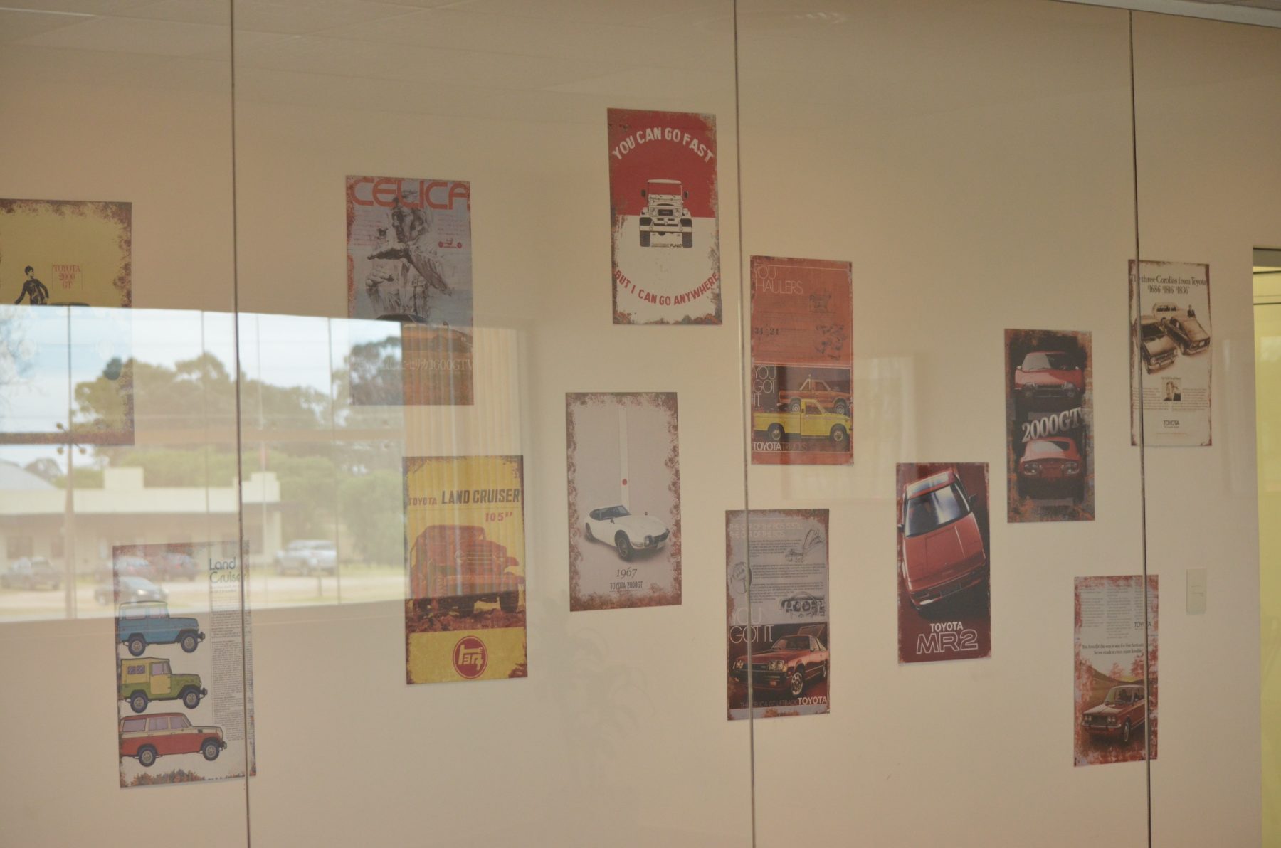
Hallway with framed historic Toyota ads
The hallways, resolved with the brand's historic ads on aged sheet metal.
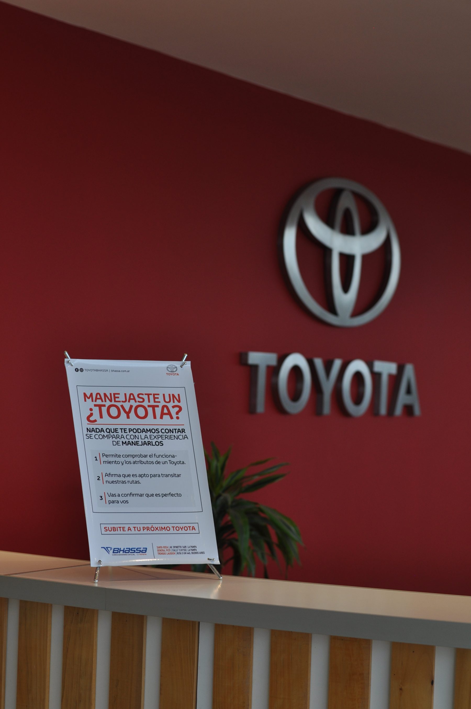
Reception with burgundy wall, Toyota ISO and test drive poster
Reception — interior signage and counter pieces with the details of the three branches.
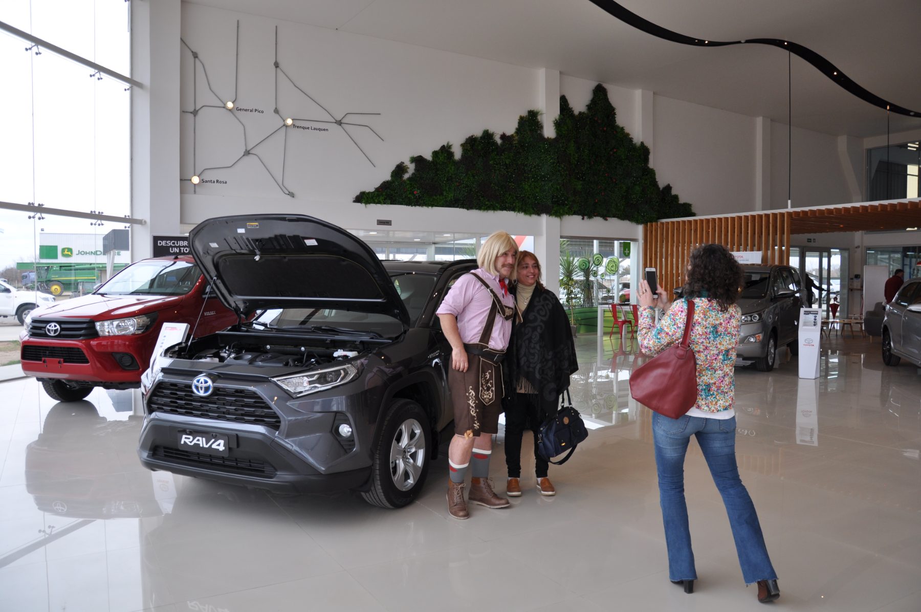
Event in the showroom with people taking photos in front of the green wall
The showroom working as a stage: one of the Plan de Ahorro events I organized there, with the green wall and the route map in the background.
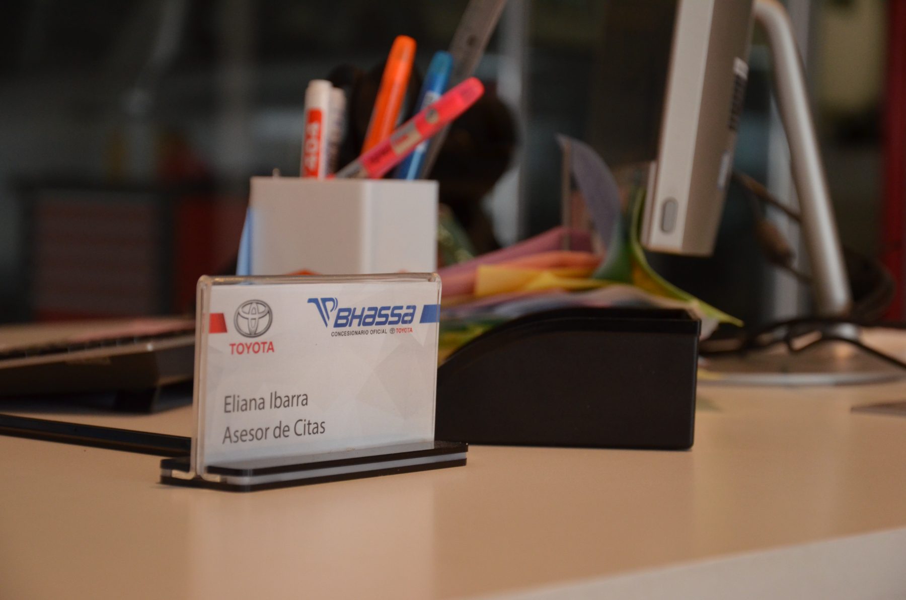
Desk sign with an advisor's name and the Toyota Bhassa lockup
Down to the last touchpoint: the desk signs, still with the previous logotype, solving the coexistence with the Toyota ISO in five centimeters.
Live
Kermesse for the 30th anniversary

The transition played out in the street.

Right after the rebrand closed came a kermesse for the 30th anniversary where both logotypes still coexisted — but the shift in aesthetics was already visible in every piece.
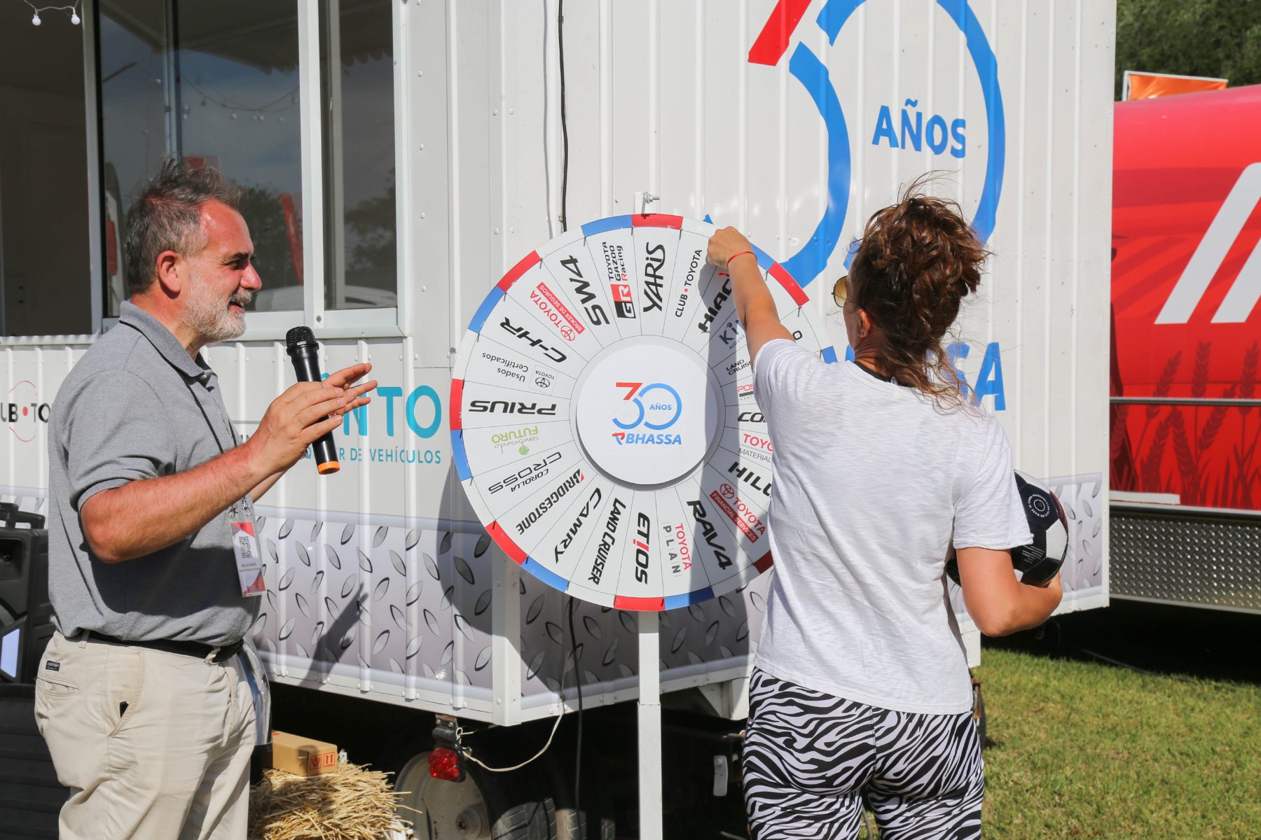
Prize wheel with Toyota brands at an outdoor event
The prize wheel, with the 30-year seal in the center and the brand graphic on the rim.
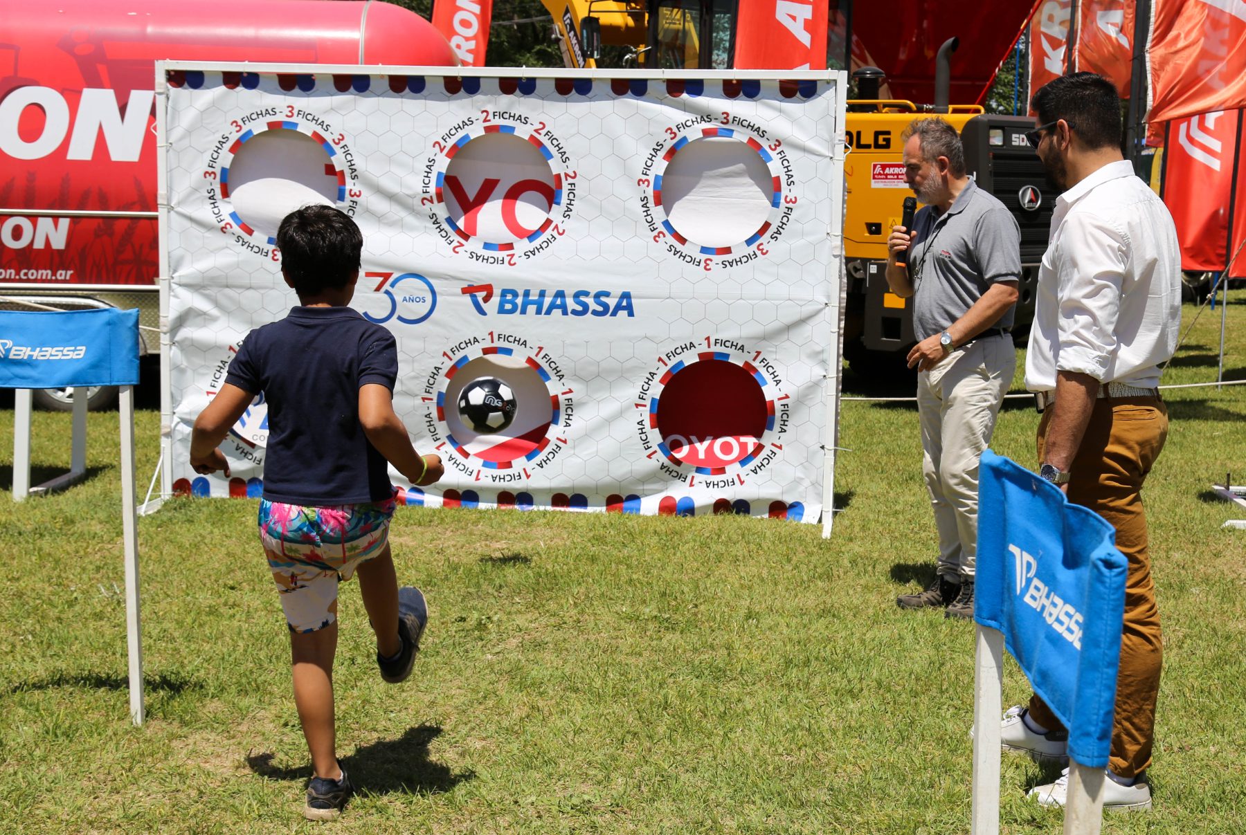
Soccer goal with the 30th anniversary campaign banner at the kermesse
Games, banners and pennants: the system brought down to one-day ephemeral pieces.
04
Impact

Instant adoption, inside and out. Zero resistance, apart from respecting the inherited silhouette.

The owners, who doubted the change, ended up embracing it. Convincing the one who doubts is worth more than a client who already wanted to move.

The system survived Toyota's centralization. What we custom-designed stayed alive even when the global brand standardized everything else.

The team made it their own. Today, seen from the outside, the brand is used in all its splendor — with more interaction and new pieces that no longer go through me.

The system was replicated in new branches and business units, and some pieces are still in use years later.

Nine years as creative partner of the group. Not a commission: a relationship.

3 cities
Santa Rosa, General Pico and Trenque Lauquen, with the same system.
2,100 → 11,500
Instagram followers over the period in which we ran the content.
2025
The custom developments stayed alive even after the centralization.
What it left me

I learned to manage a brand completely, from every angle.

It took me to a level I hadn't valued until I saw it from the outside. It powered everything that came after.

Let's work together

Do you have a brand with years behind it that needs updating without losing what made it recognizable?

That's what we did here: modernize the complete system —from the isologotype to signage, from fleet wraps to the physical space— while respecting the symbol the community already recognized.

Write to me WhatsApp