Vinoma
Handmade Argentine empanadas in Rohnert Park, California. Brand, illustrations and signage from scratch, with a short brief: make it look artisanal, because the production is artisanal and limited.
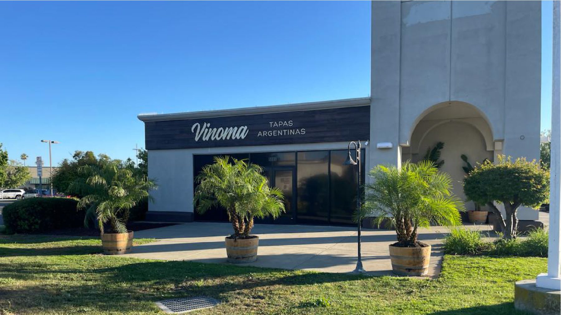
Rohnert Park, California
Identity, illustration and pieces
Shop, menu, outdoor and web
Content and posters, year after year
Selling Argentine empanadas in California: the customer needs to be told what they're buying, without it looking like industrial food.
Production is limited and handmade, so the brand had to hold that promise from the very first contact —a façade, a shop window, a poster at the bus stop. In an industry where almost everything pretends to be artisanal, that is a drawing problem, not an adjectives problem.
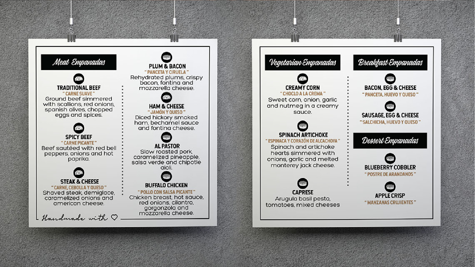
There was a second task: the menu mixes Argentine classics with American inventions, and each variety needed to stand apart from the others without breaking the whole.
The illustration doesn't accompany the brand: the brand is the illustration.
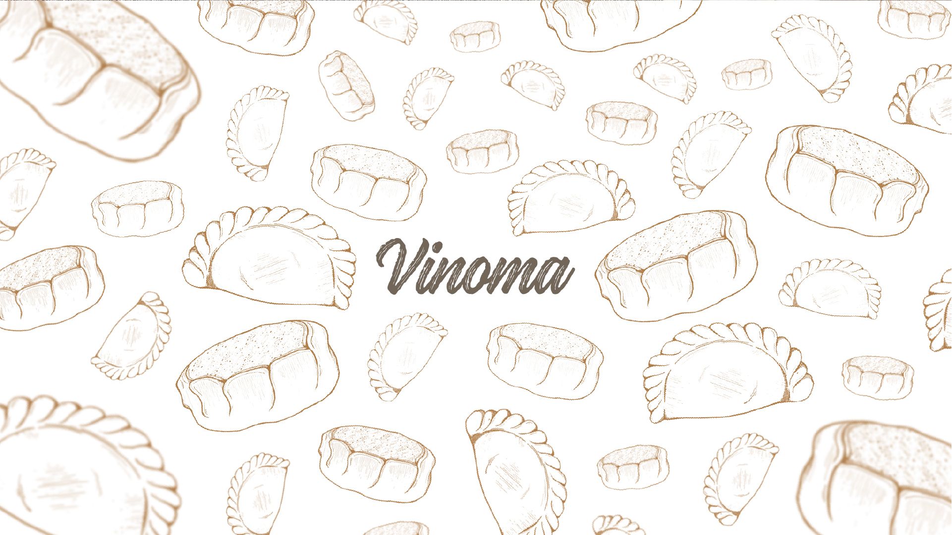
A logo alone wasn't enough to fill a shop. We drew the empanadas in pencil, one by one, and that repertoire became the brand's material: it covers the tablecloth, the menu, the cards and the shop window, and each surface can say something different without ceasing to be the same brand.
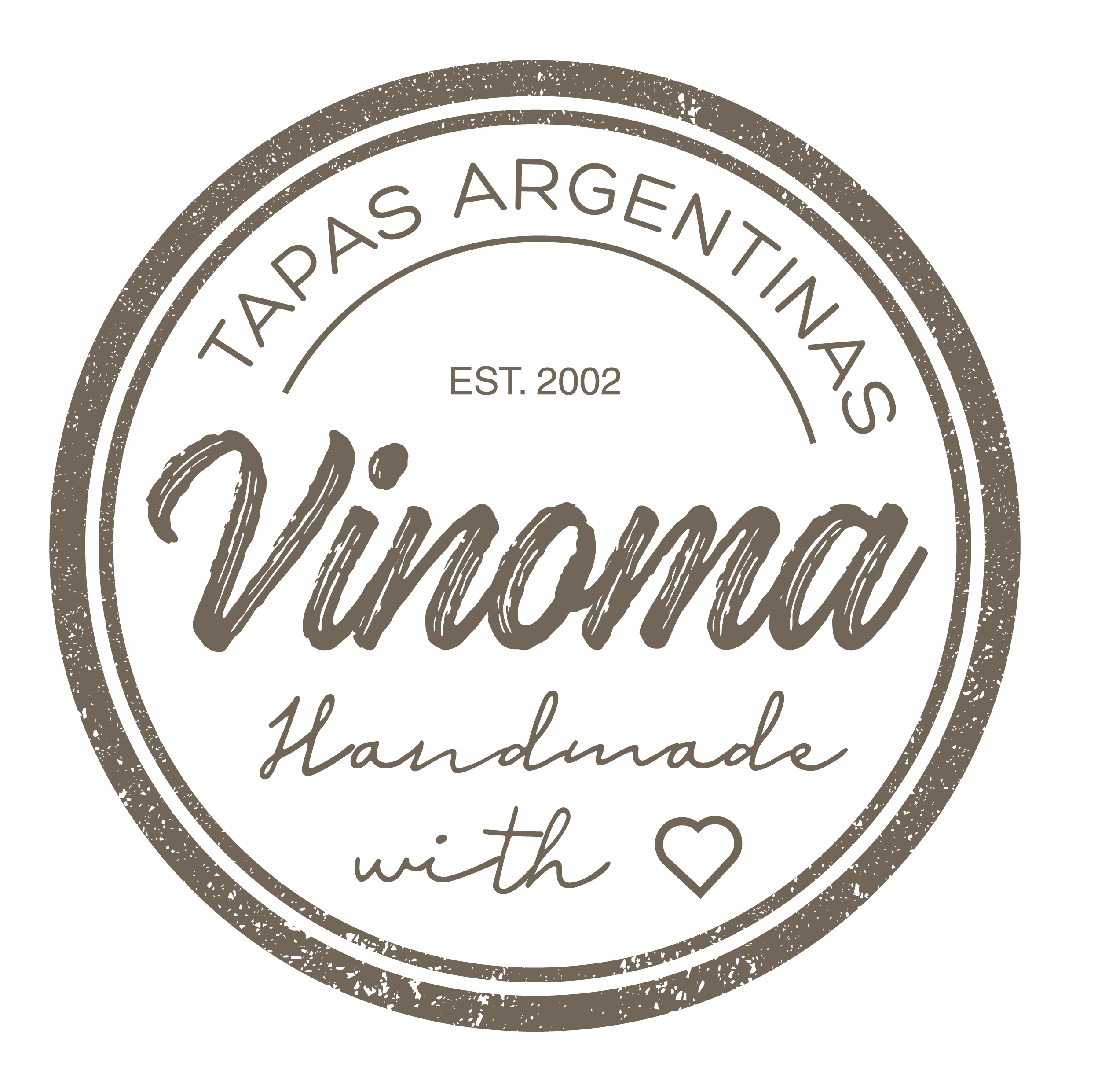
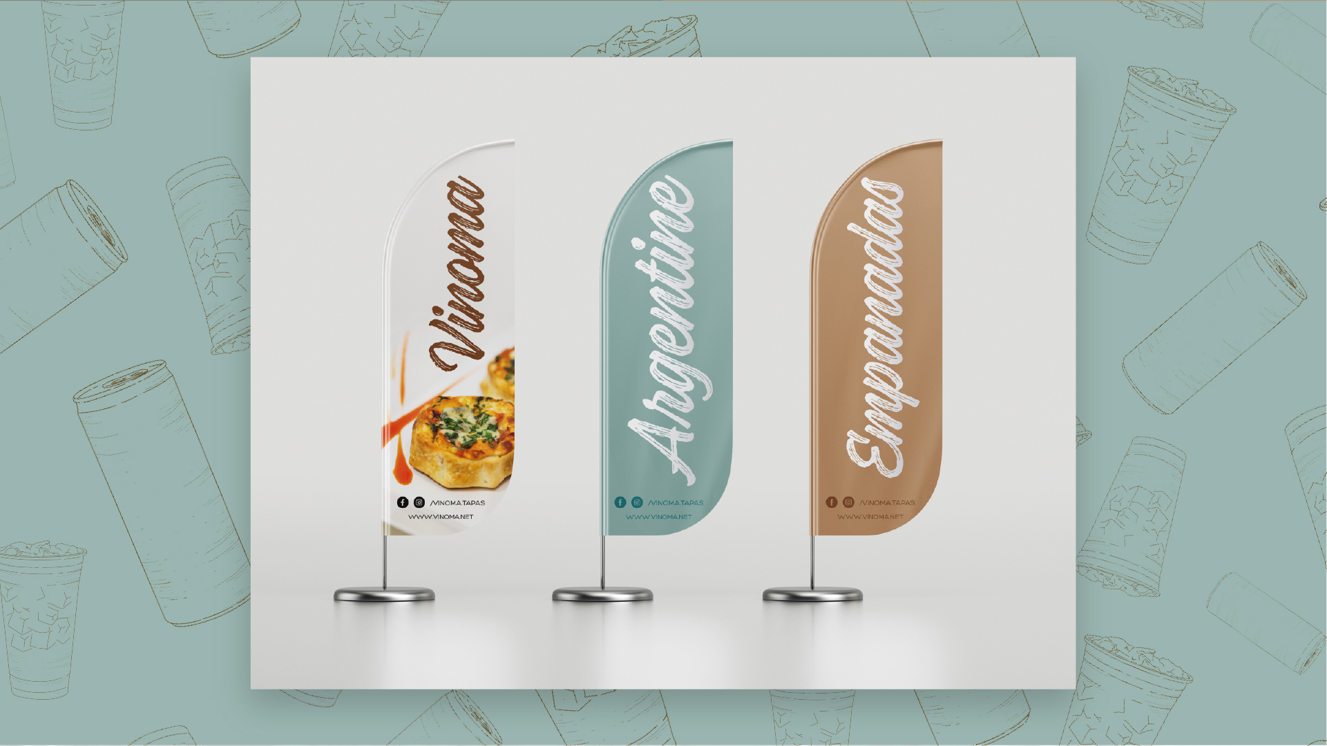
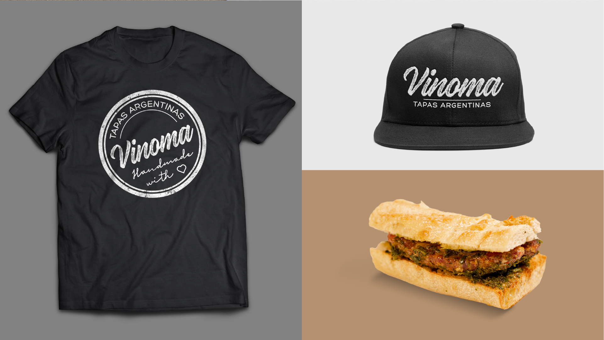
The logotype is a brushstroke with the texture of the stroke in plain view: irregular on purpose, so the hand can be read. The round seal is the version that holds up embroidered, engraved in wood or stamped on kraft paper.
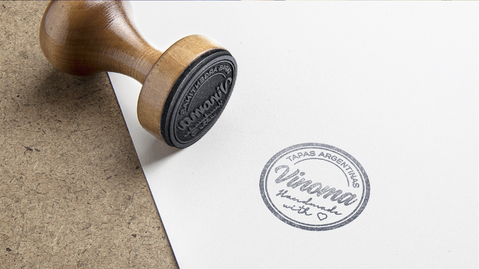
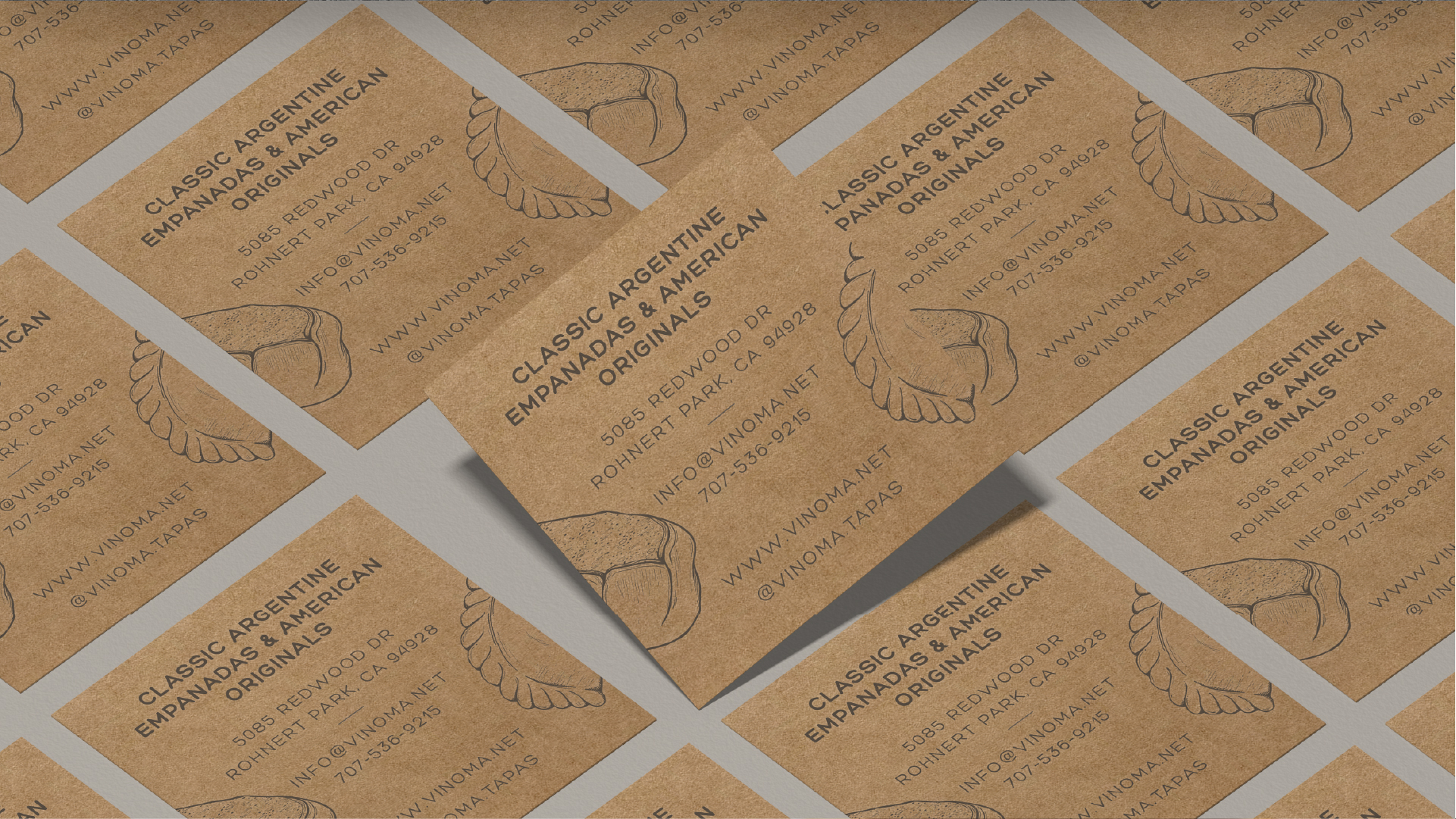
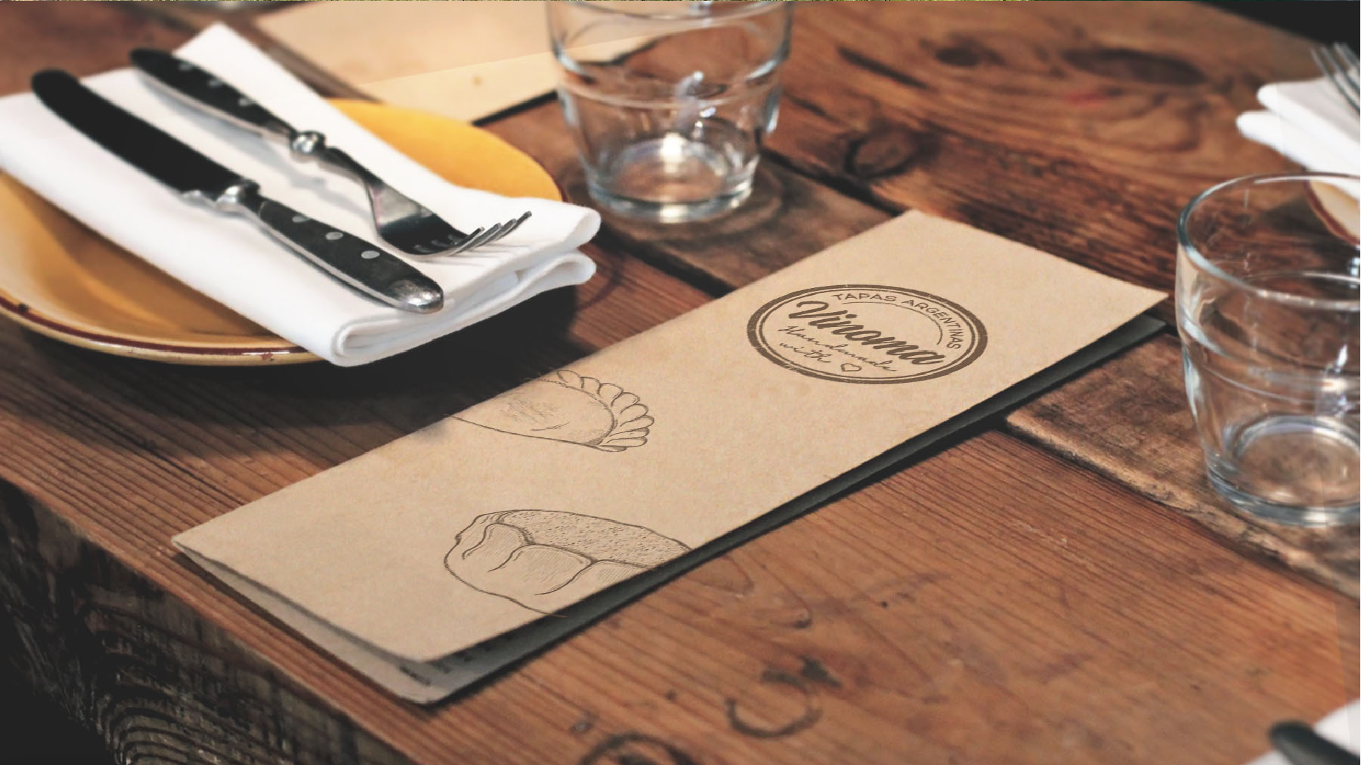
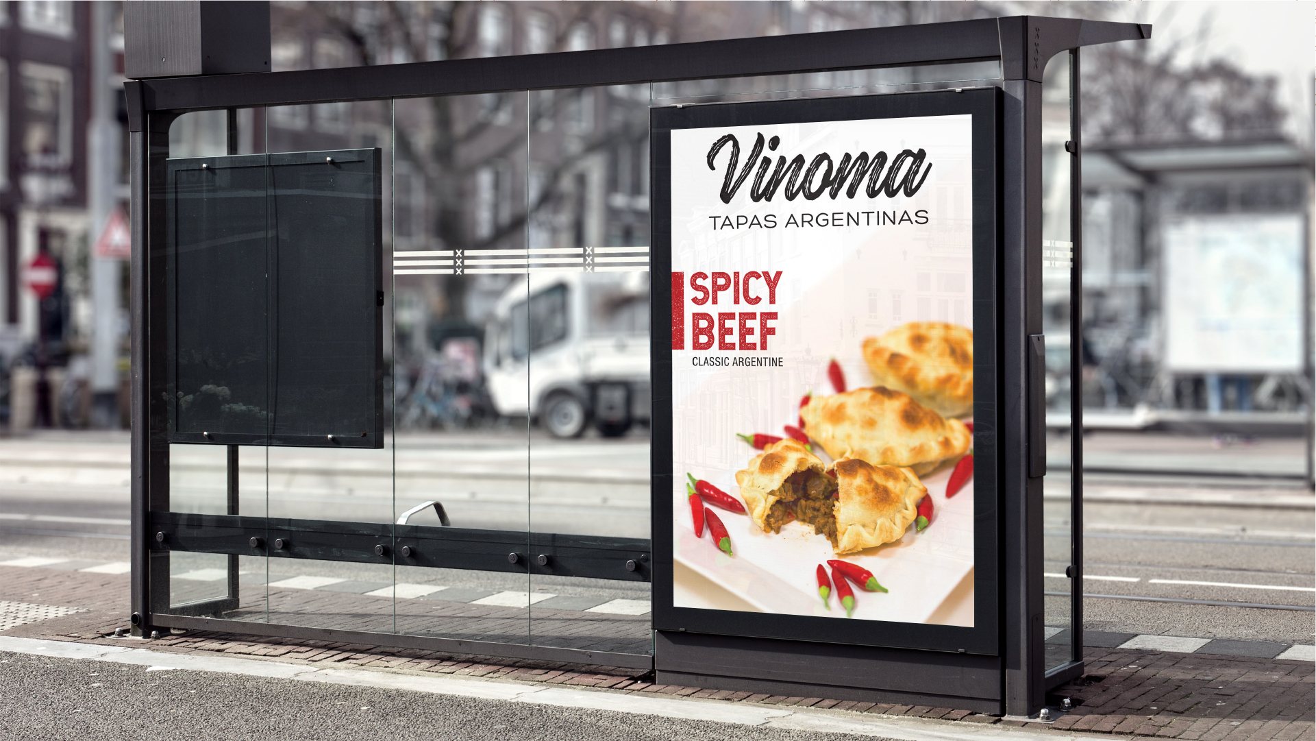
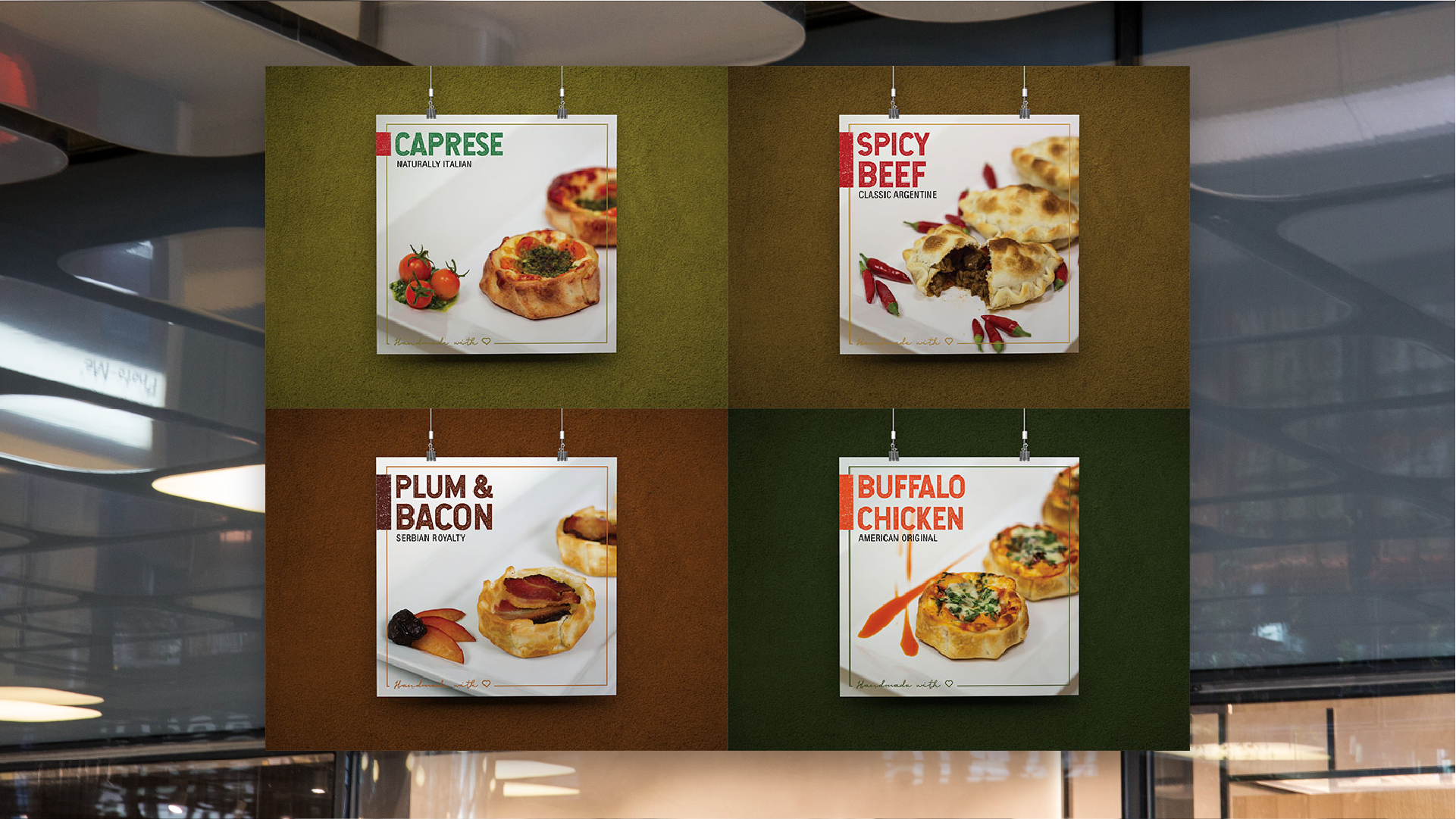
Outside the shop, the brand competes with giant food photos. The solution was not to fight: light background, lots of air, the name in brushstroke and a single variety per piece, named in English with its origin below — Classic Argentine, American Original, Naturally Italian.

Artisanal isn't declared: it's drawn.
Any brand can write “handmade” on its sign. What convinces is that the stroke has irregularities, that the paper isn't laminated and that the drawing belongs to that product and not to a stock library. Six years of pieces later, the brand keeps growing with the same repertoire: every new flavor comes in as one more drawing.