Birdie Apparel · Brand and product design · 2021 — 2022

Six capsules, one brand.

In apparel the brand isn't applied on the product: it is the product. Each drop needed graphics with a life of their own, and all of them had to remain Birdie.

01
The approach

A fixed logo would have killed the brand; six loose logos would have too.

The way out was to separate two layers. Underneath, a parent brand that is never touched: the handwritten logotype, the B in a circle and a single color rule —white on black, always. On top, free graphics per capsule, with permission to change typographic register completely.

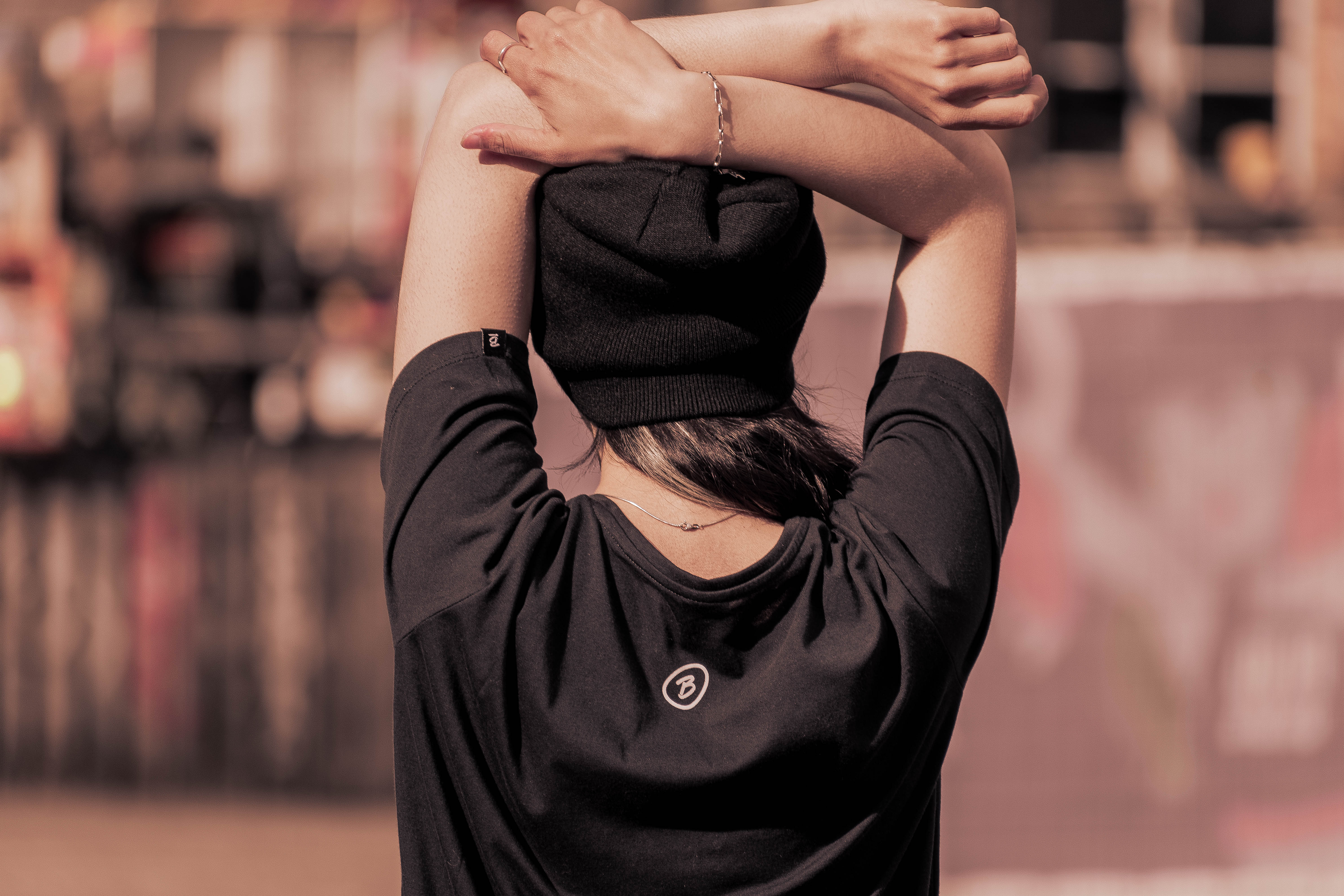
What holds the whole together isn't a style, it's the application system: small chest print on the front, B on the back, label on the sleeve. The same garment, the same photo, the same distance. The drawing changes and nothing else.
02 · The parent brand
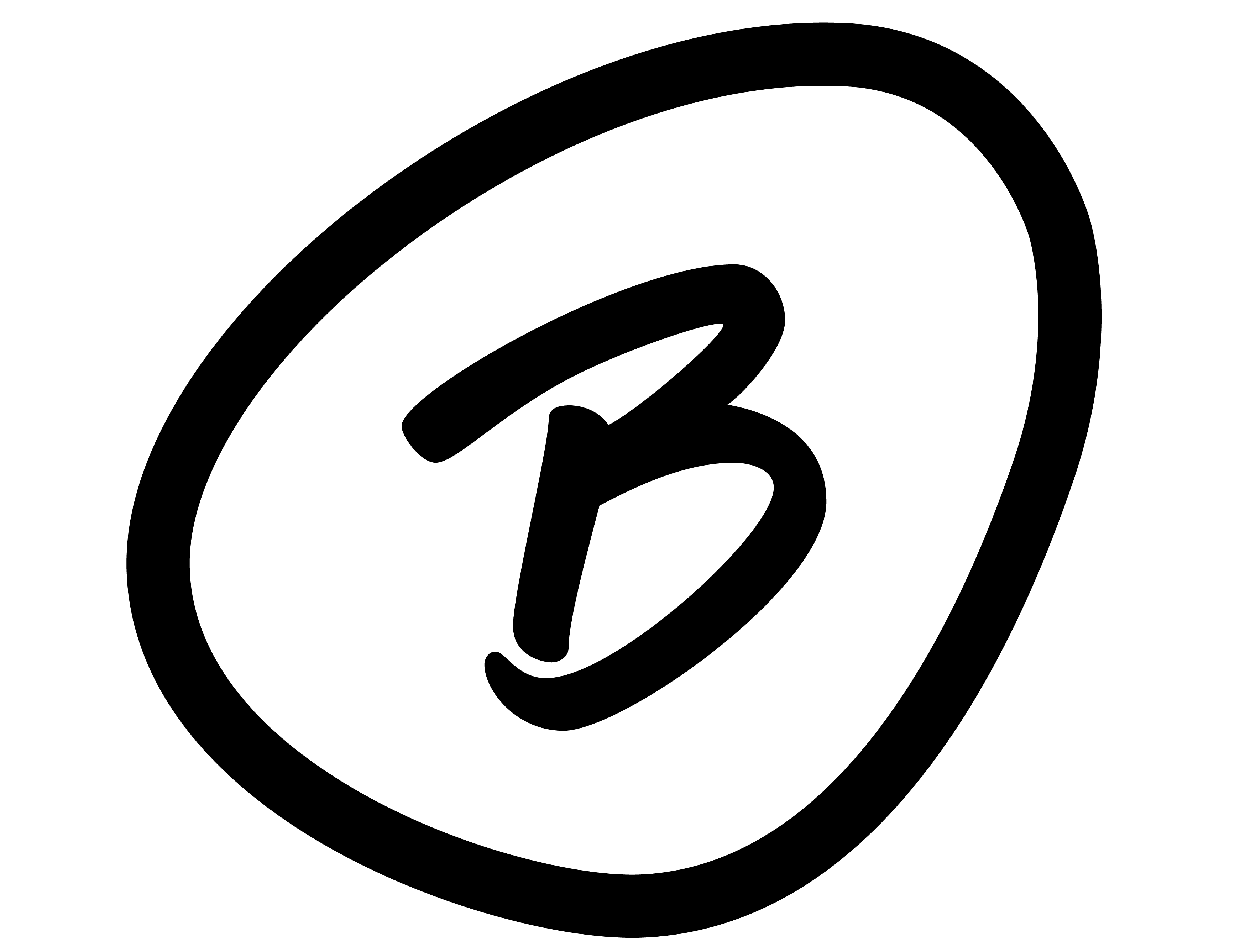
Birdie isotype: a handwritten B inside a hand-drawn circle

The B in a circle is what holds up at small size: embroidered on the back, woven into the sleeve label, avatar in the feed. It's the signature that lets the front do anything.

The stroke is deliberately irregular —a circle closed by hand, not a perfect ring. On a skate brand, geometric neatness would read as corporate.

@birdie.cloth ↗
03 · The six capsules

Each drop brings its own language: retro display, line-art, drawn lettering, distortion, fine script. Side by side they look like six brands; on the hanger they're the same one.
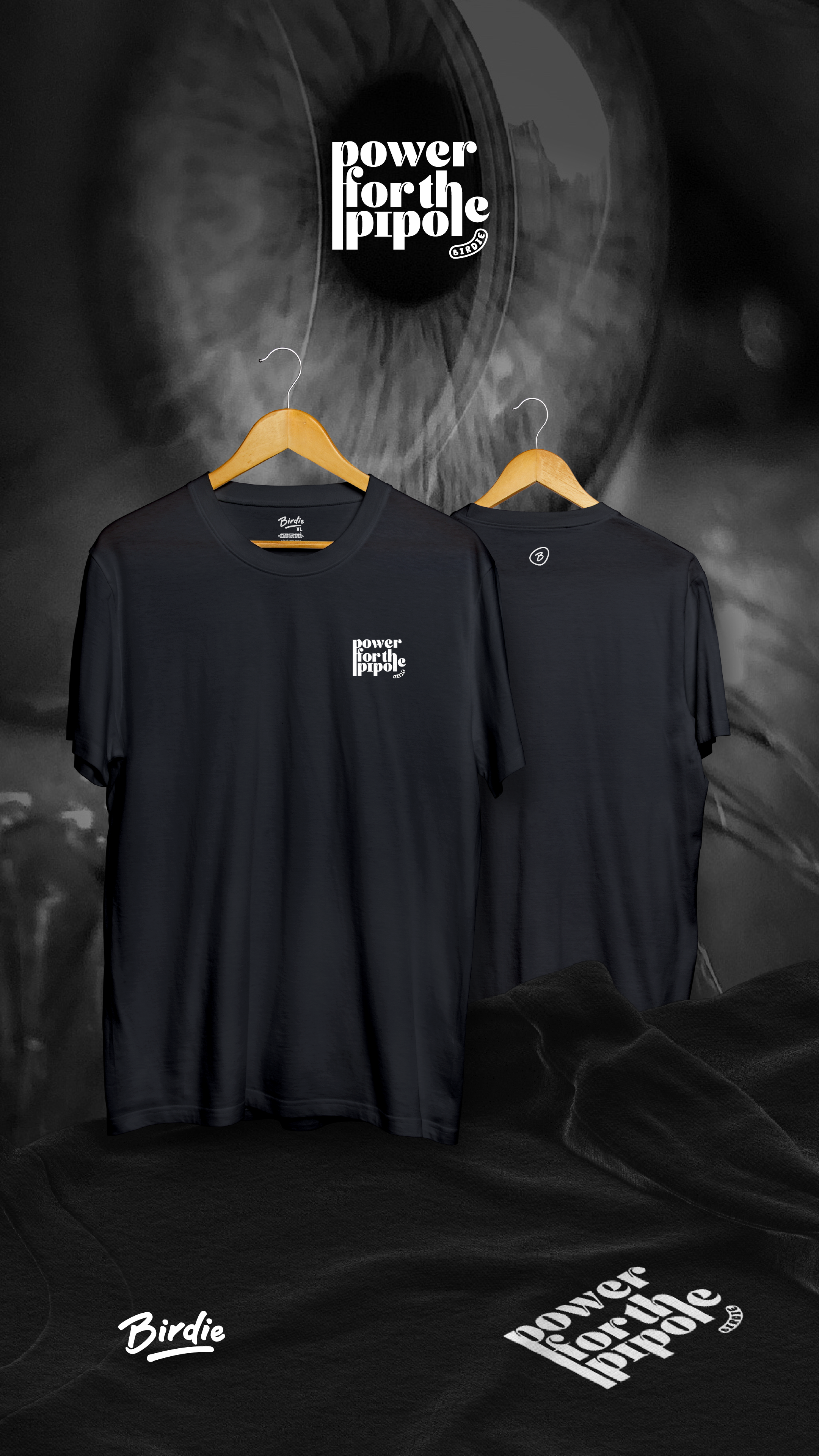
Birdie Power for the Pipole capsule on an eye background
Power for the Pipole — condensed retro display, fitted into four lines.
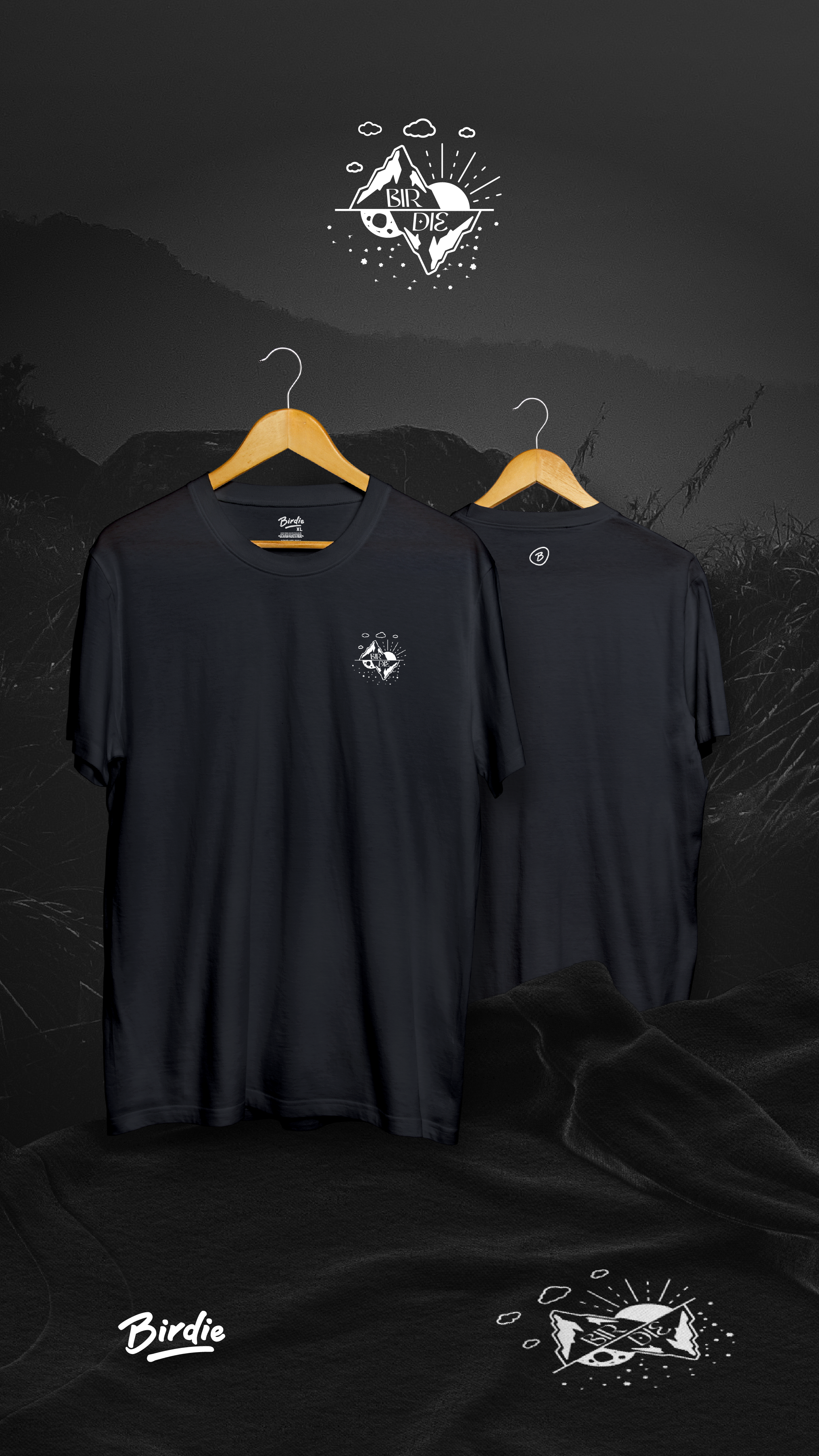
Birdie Dinite capsule with mountains, moon and stars in line-art
Dinite — line-art of mountain, moon and sun splitting the diamond in half.
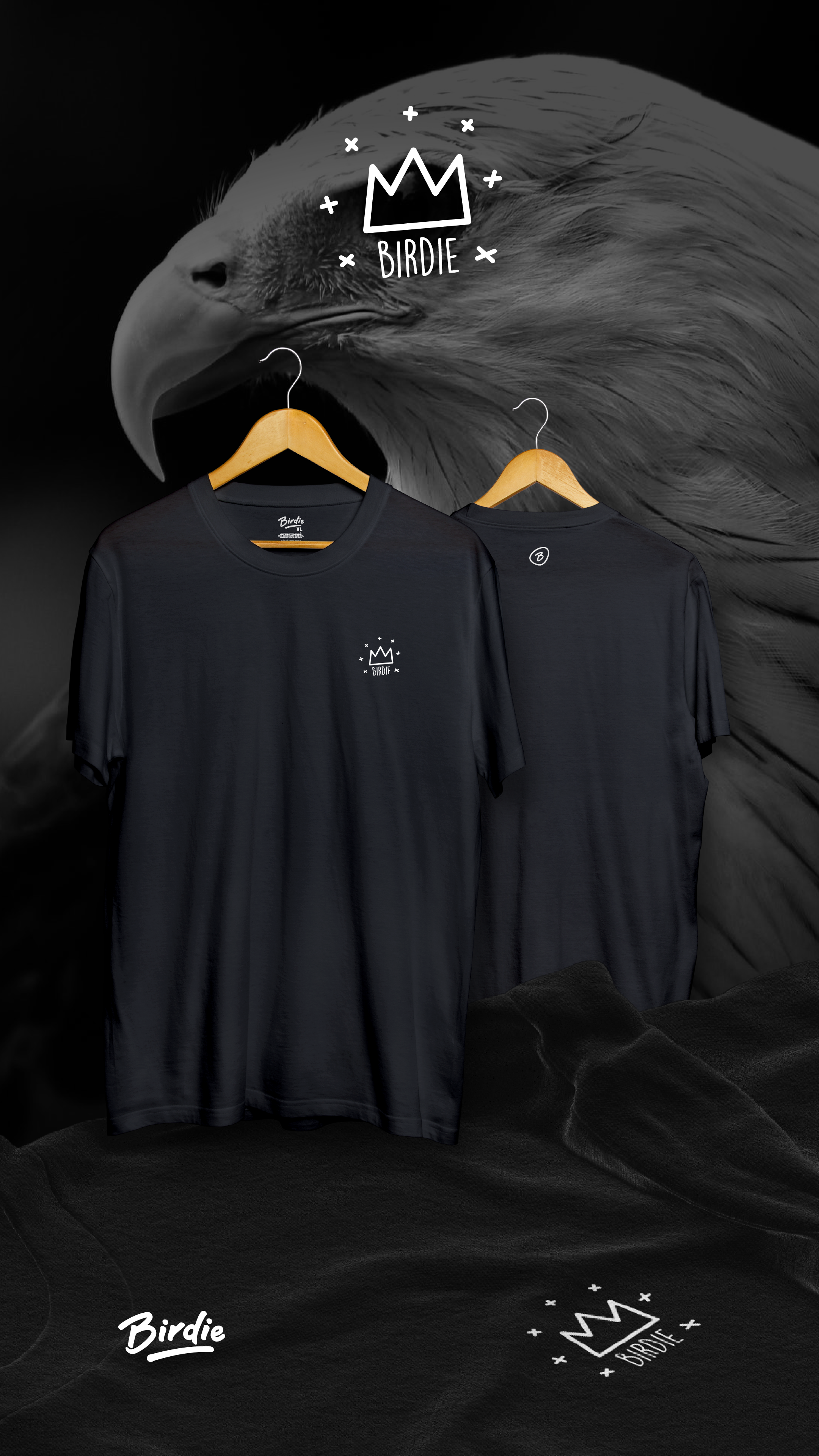
Birdie King capsule with a hand-drawn crown over an eagle
King — freehand crown, the most gestural piece in the series.
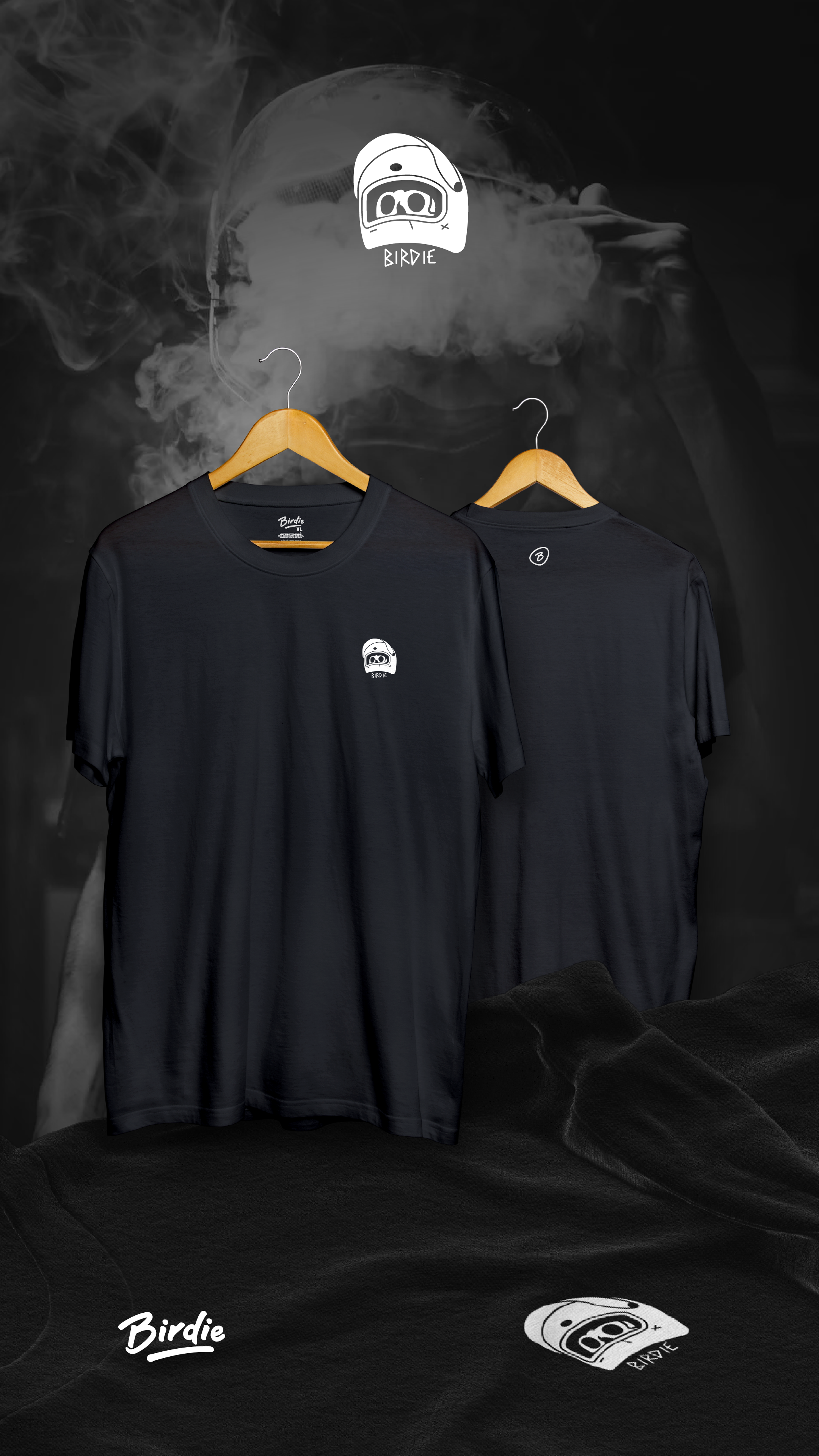
Birdie Safe capsule with a helmet drawn over smoke
Safe — heavy-stroke helmet: the same pulse as the B, in illustration form.
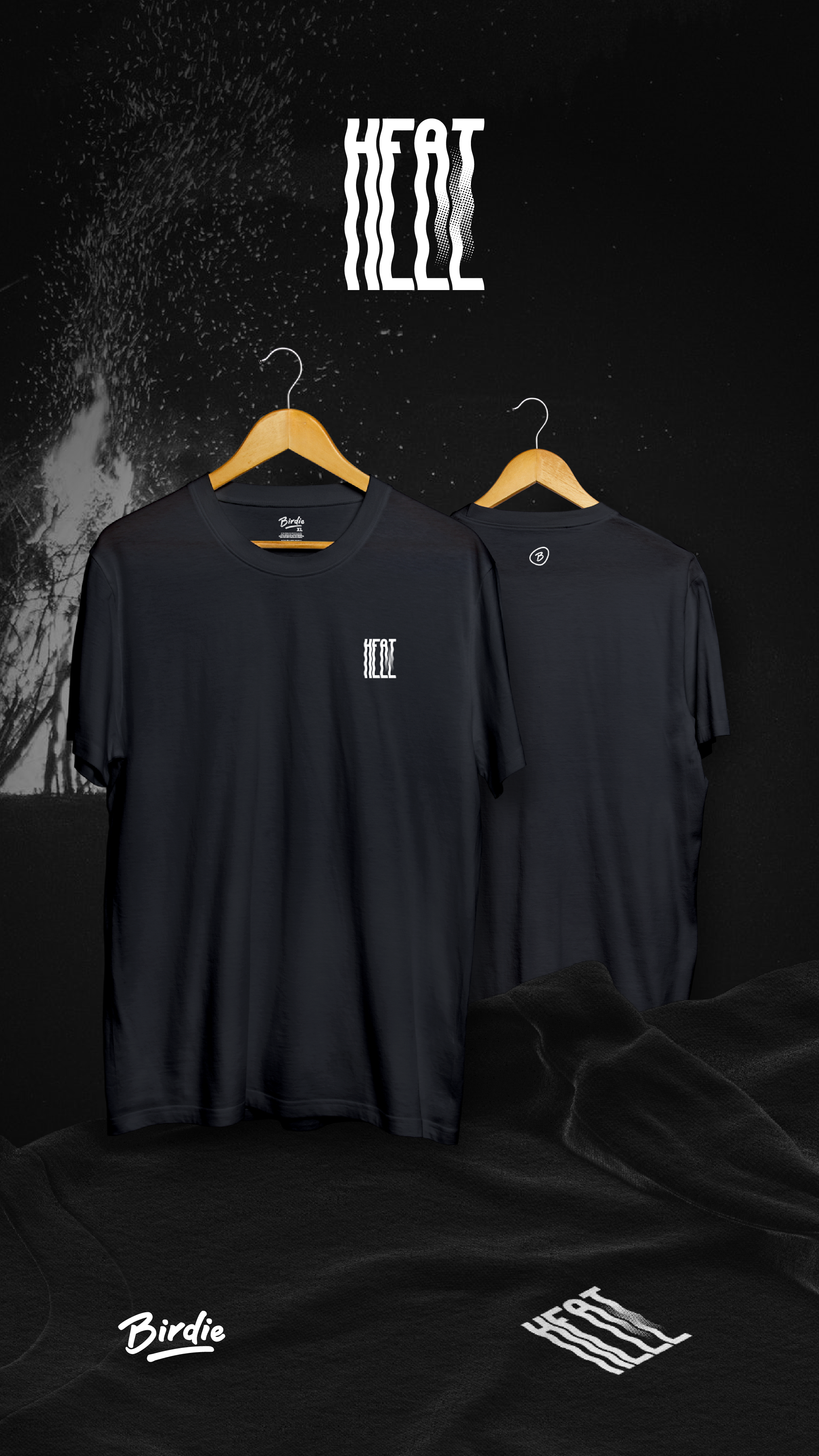
Birdie Hell or Heat capsule with the two words overlapped and distorted
Hell or Heat — two words in the same space, resolved with wave and texture.
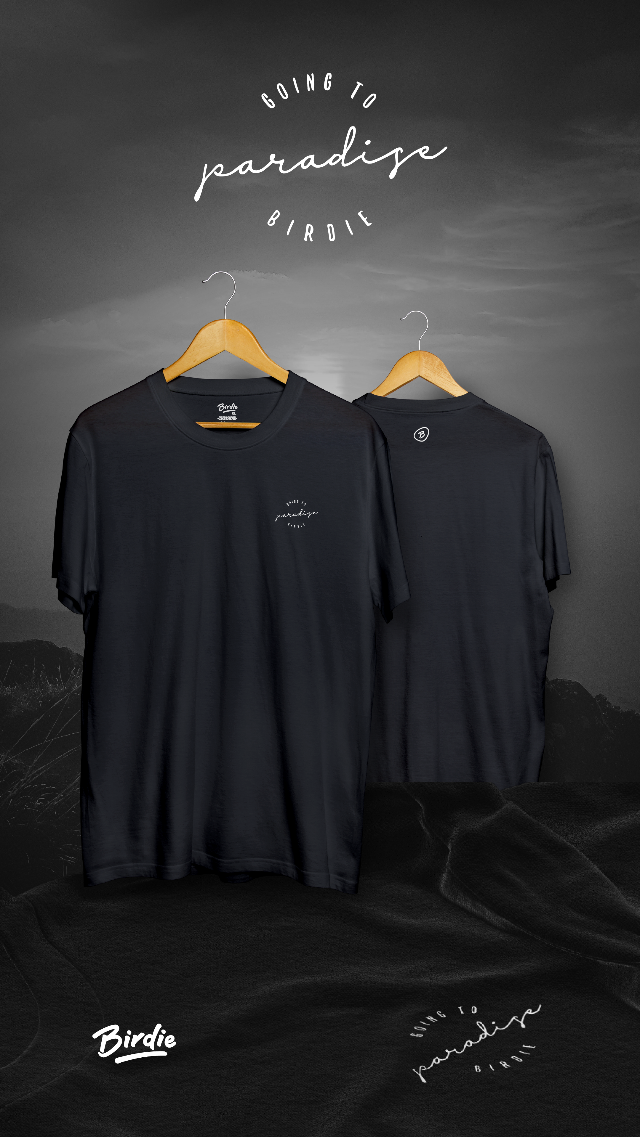
Birdie Going to Paradise capsule with fine script in a circular composition
Going to Paradise — fine script in a ring, the quiet extreme of the system.
04 · Worn

Proof that the system works isn't in the presentation: it's on the street, with the garment worn and the logo twelve centimeters from the chest.
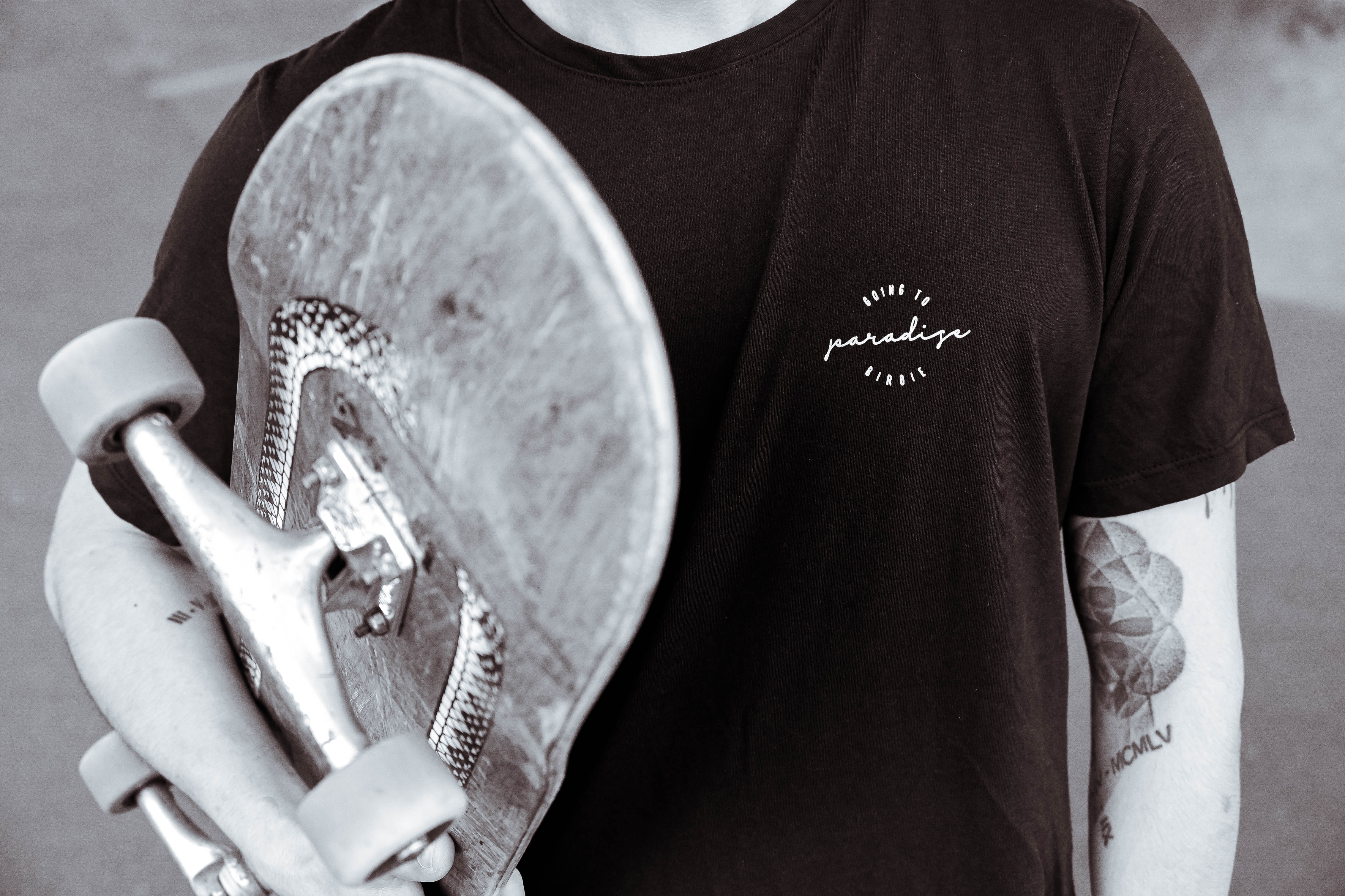
Going to Paradise print on the chest of a black t-shirt, with a skateboard over the shoulder
Small chest: the print reads up close, it doesn't shout from ten meters.
Back of a Birdie garment with the B in a circle below the collar
The B below the collar is the only thing repeated across all six capsules.
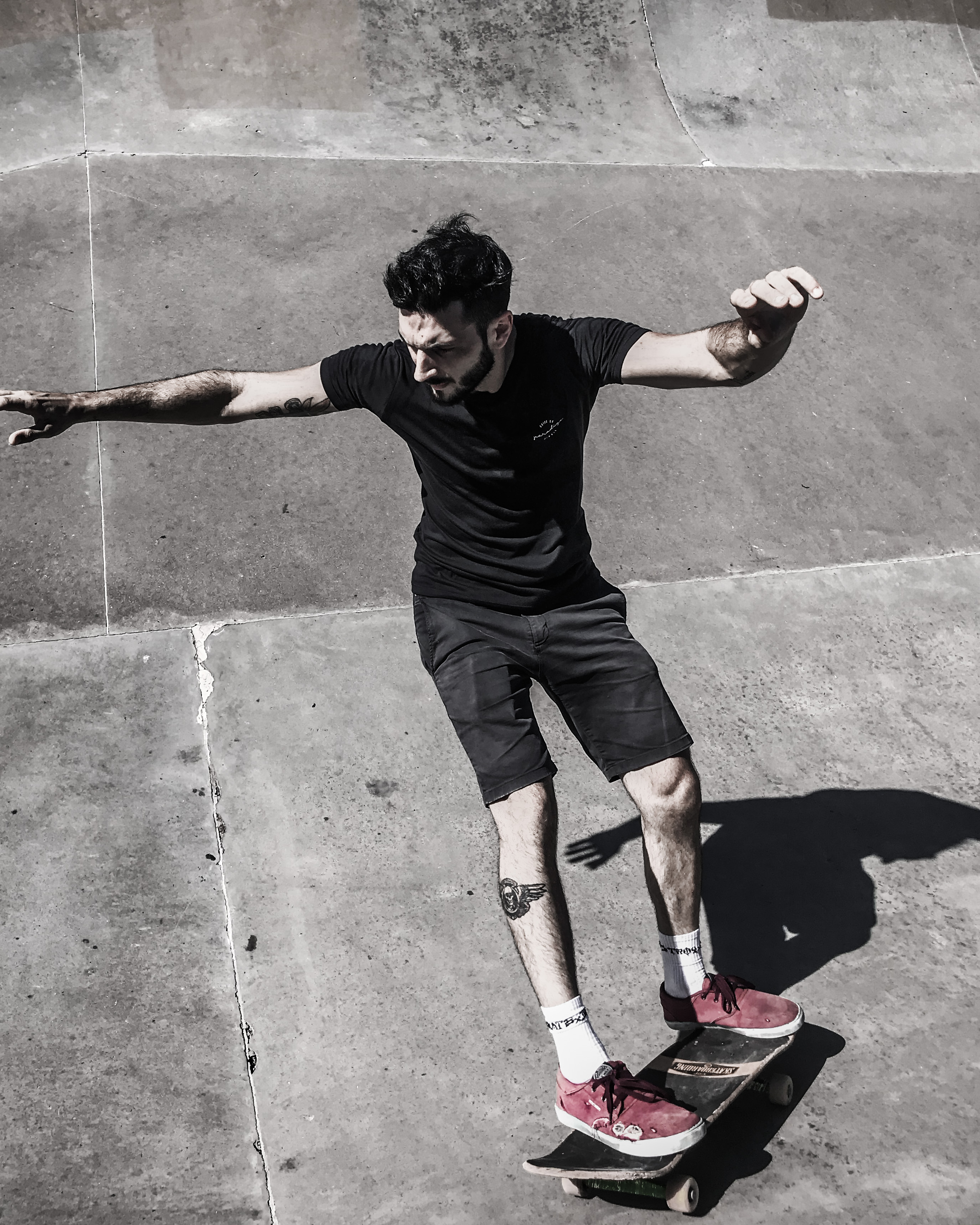
Skater riding in the park in a Birdie t-shirt
In motion the brand almost disappears. That's what was intended.
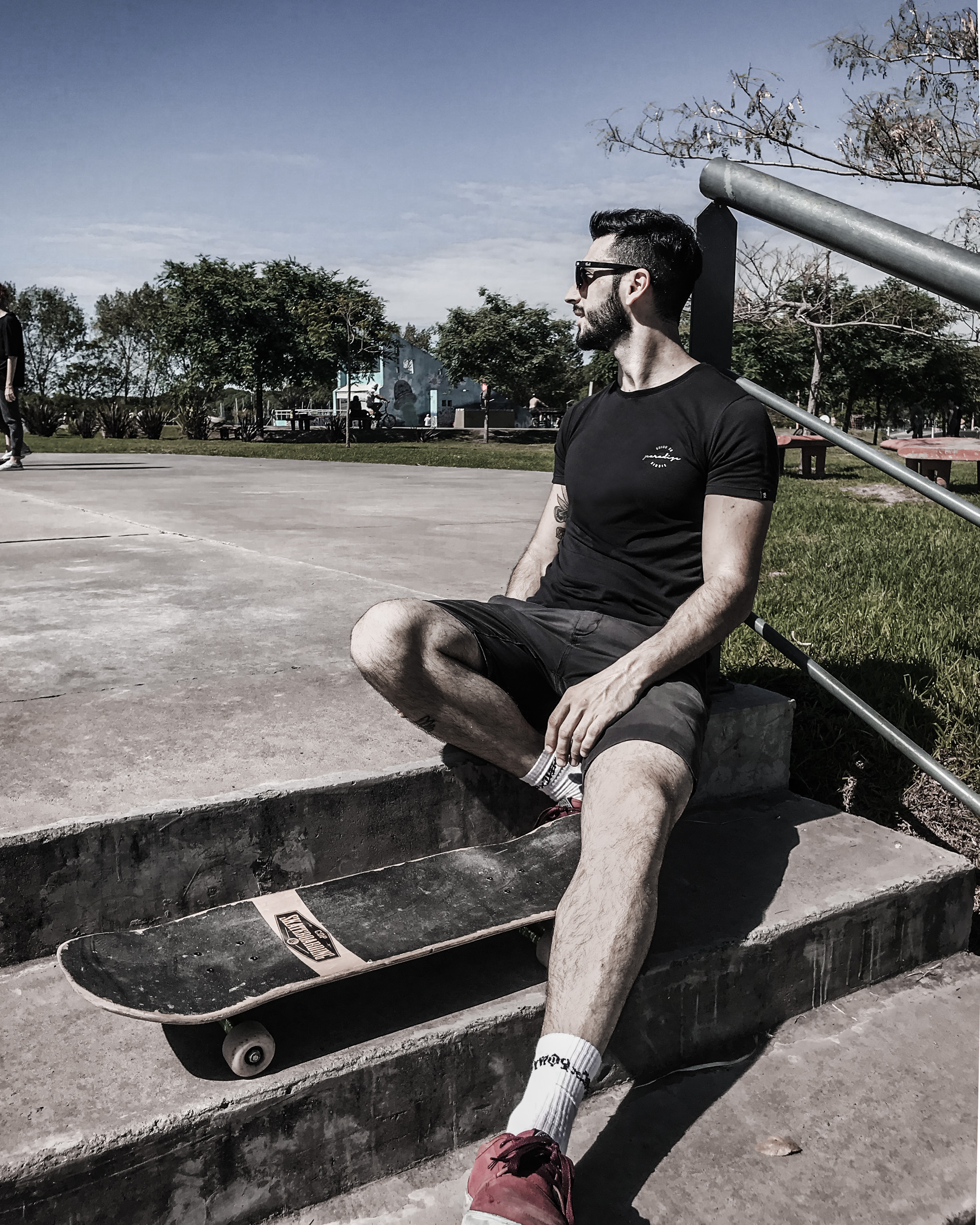
Skater sitting on the edge of a ramp in a Birdie t-shirt
The audience is the same one that buys: skatepark, not a photo studio.
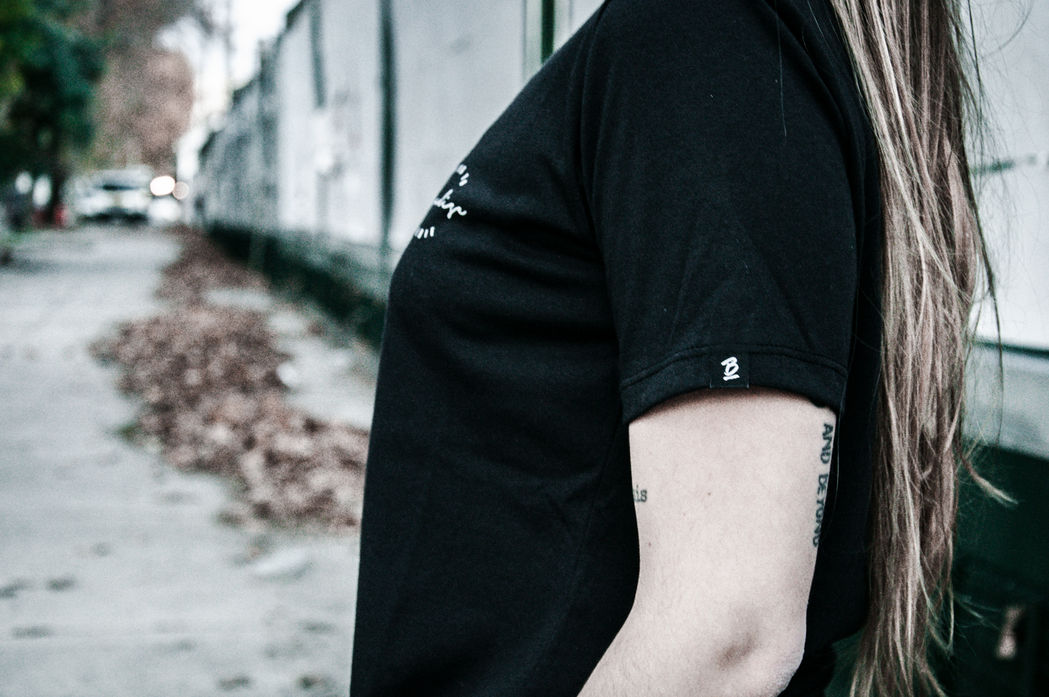
Woven label with Birdie's B on the sleeve hem
Sleeve label: the detail that separates a printed t-shirt from a brand.
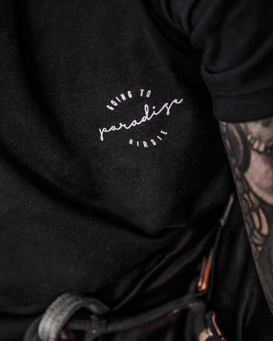
Detail of the Going to Paradise print on black cotton
Fine stroke in white screen print: the limit of what the garment can bear.
What it left me

A brand can change style every season if the application system doesn't move.

It's the opposite of the classic manual, which fixes the style and frees the rest. Here the constant is where each thing goes, not how it's drawn. That criterion later served me in packaging: at Thiafel the can does the same job as the hanger.

See Thiafel →
Let's work together

Do you have a brand that has to change without ceasing to be recognized?

Write to me WhatsApp