Cerveza Thiafel
A neighborhood microbrewery in Sáenz Peña. The brand development stayed in the logo; the long work began afterward: the graphics for all the cans they've released, year after year, since 2020.
Sáenz Peña, Buenos Aires Province
Design of each label
Includes three collaborations
One label per release
In a neighborhood brewery, the can is the only place where the brand appears in full.
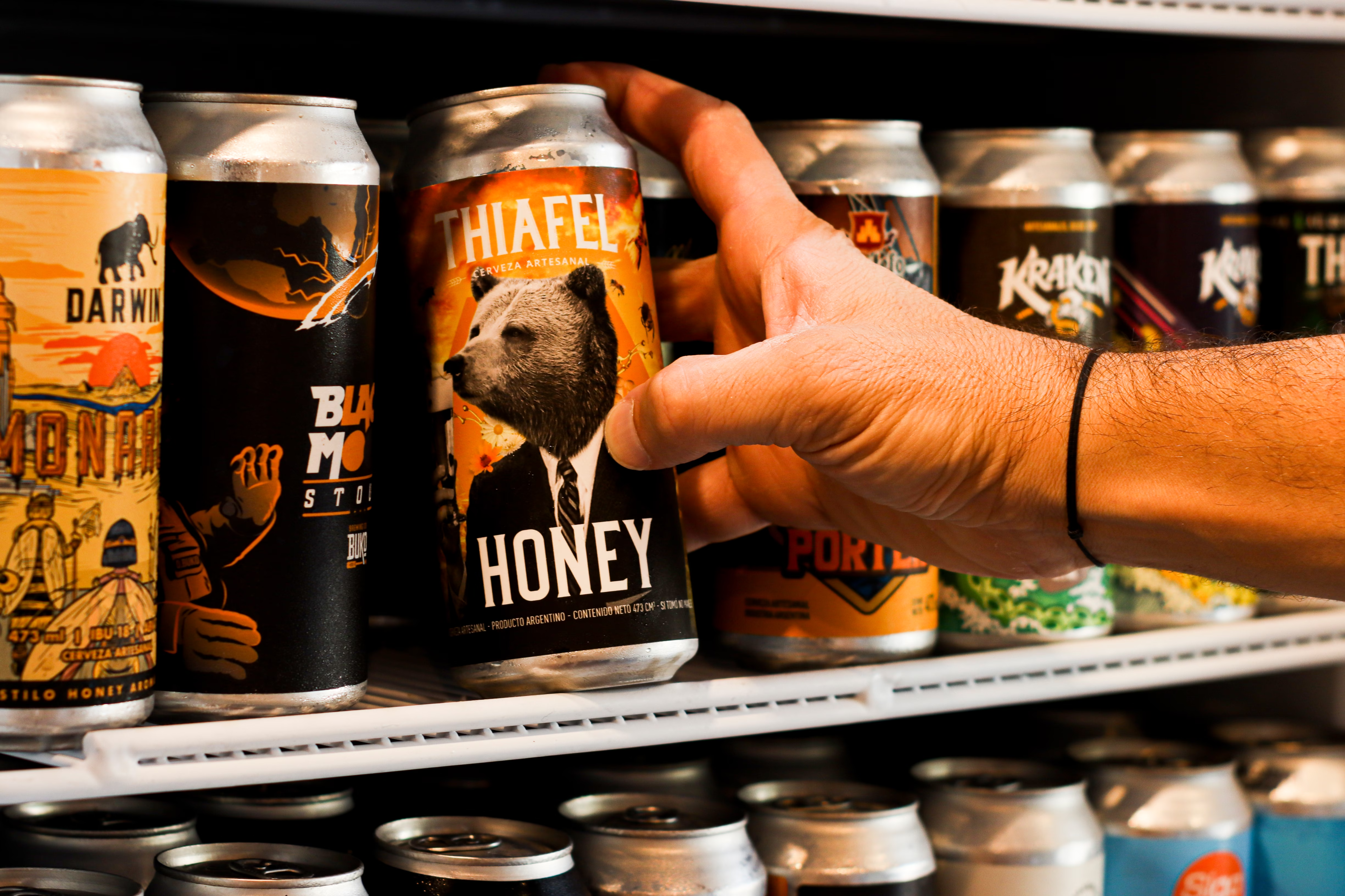
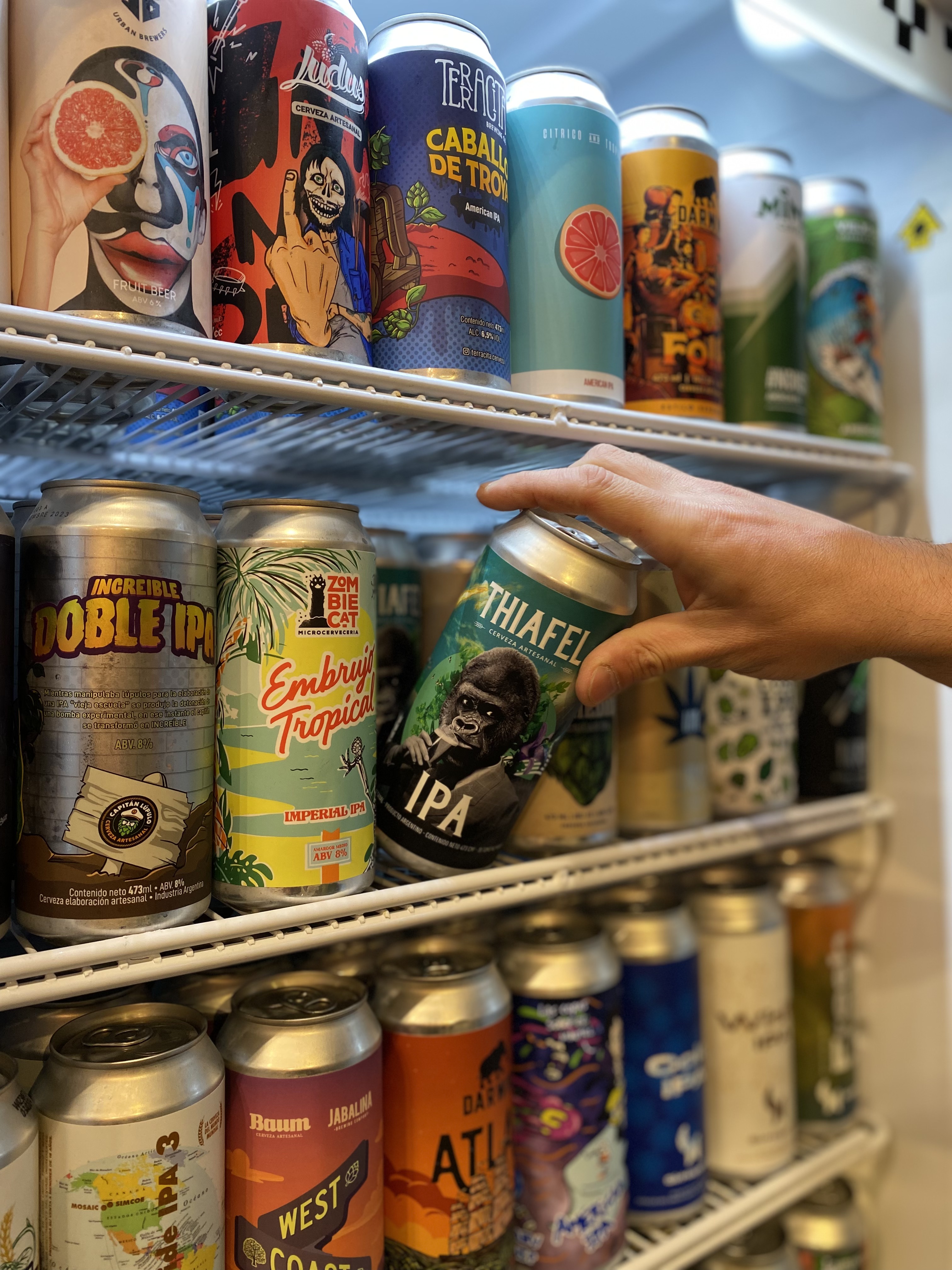
In a bar's fridge, the can competes with twenty other labels at the same distance and under the same light. It has to say whose it is before saying what style it is, and carry the mandatory information —alcohol, IBU, ingredients, volume— without the front turning into a spec sheet.
The other part of the problem is scale: every so often a new variety comes out, sometimes a limited edition or a collaboration with another brewery. The system had to withstand six years of releases without becoming repetitive or losing the family.
A logotype that holds up small and in a single ink.
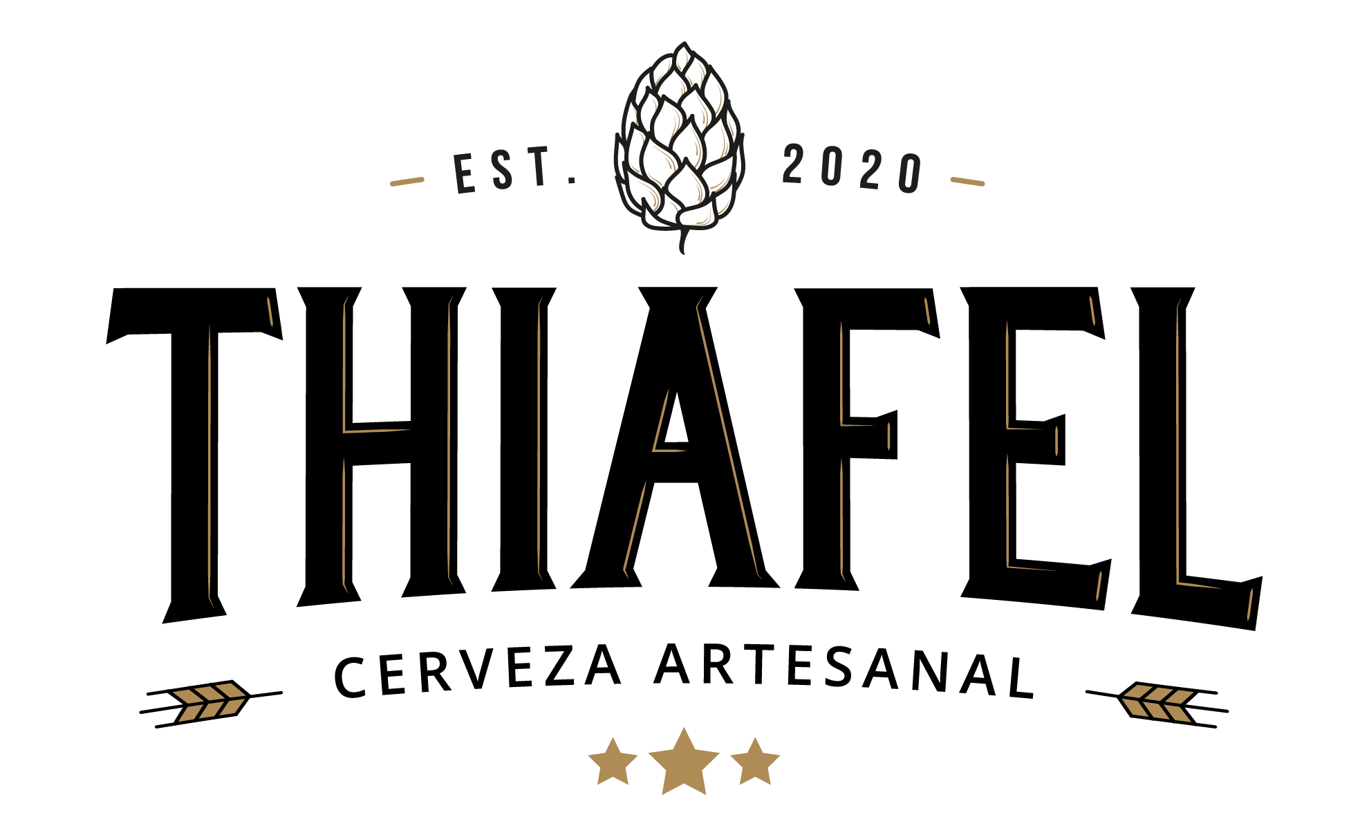
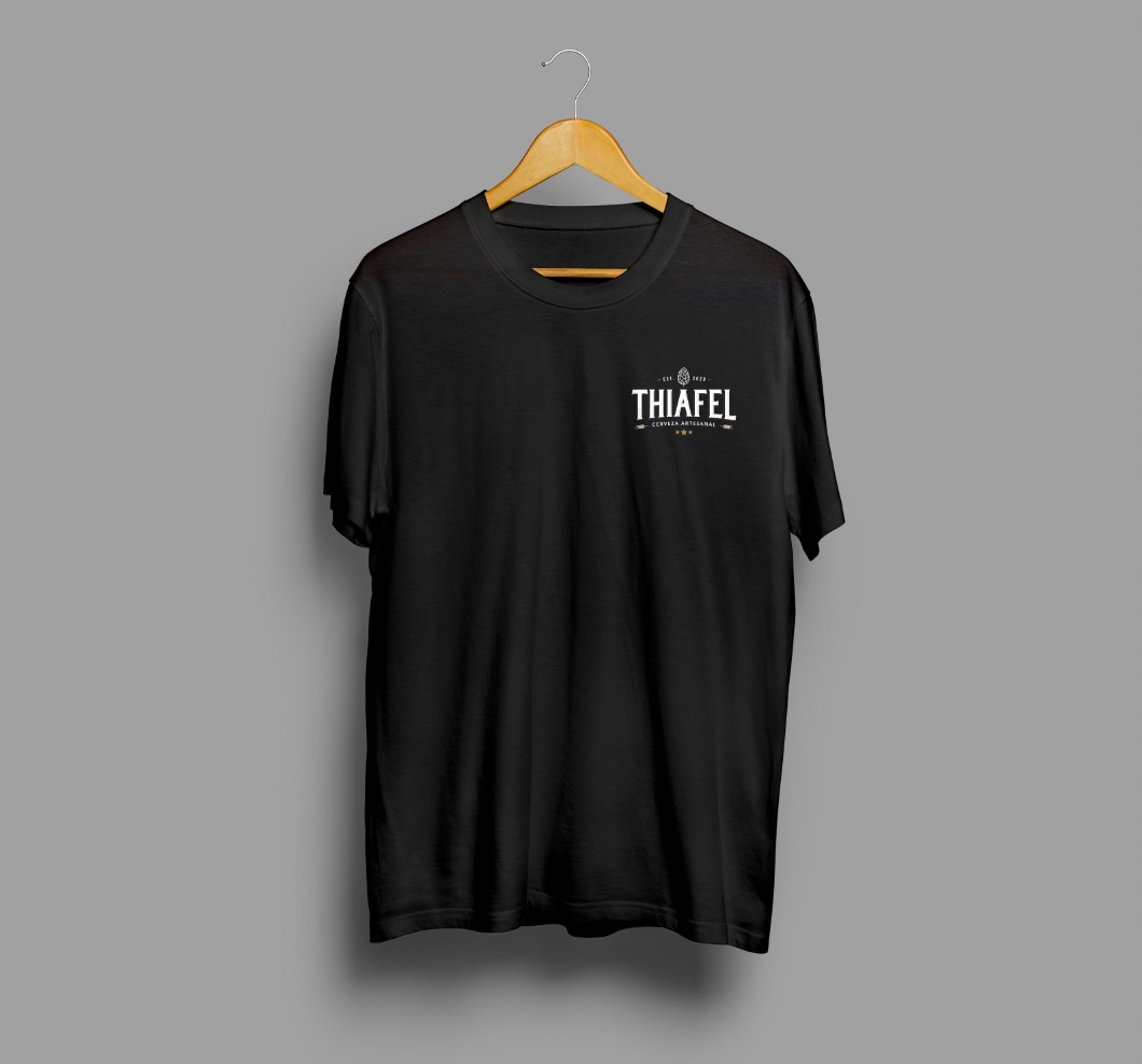
Sans-serif type with carved terminals, the hop as an icon and two service lines: the founding year on top, “cerveza artesanal” below. On the can it's always white, and on the rest of the pieces it works in black or gold without touch-ups.

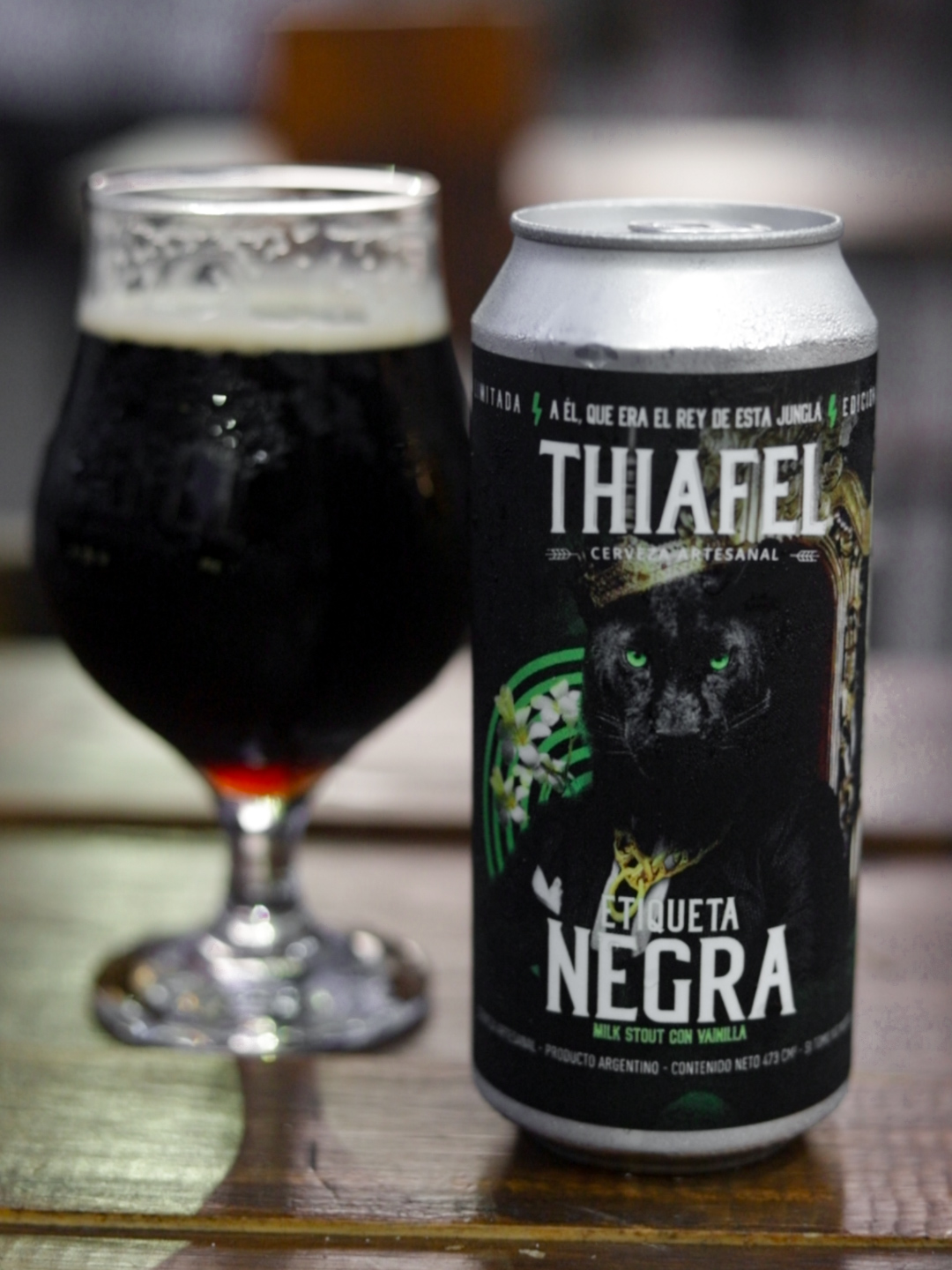
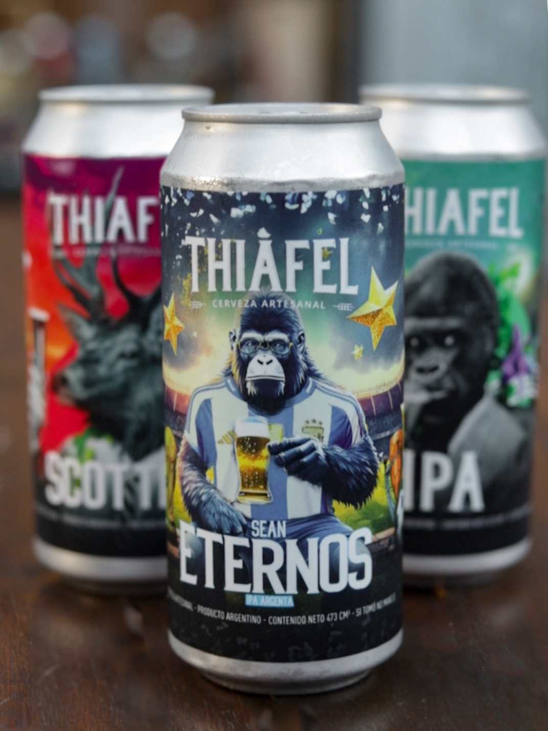
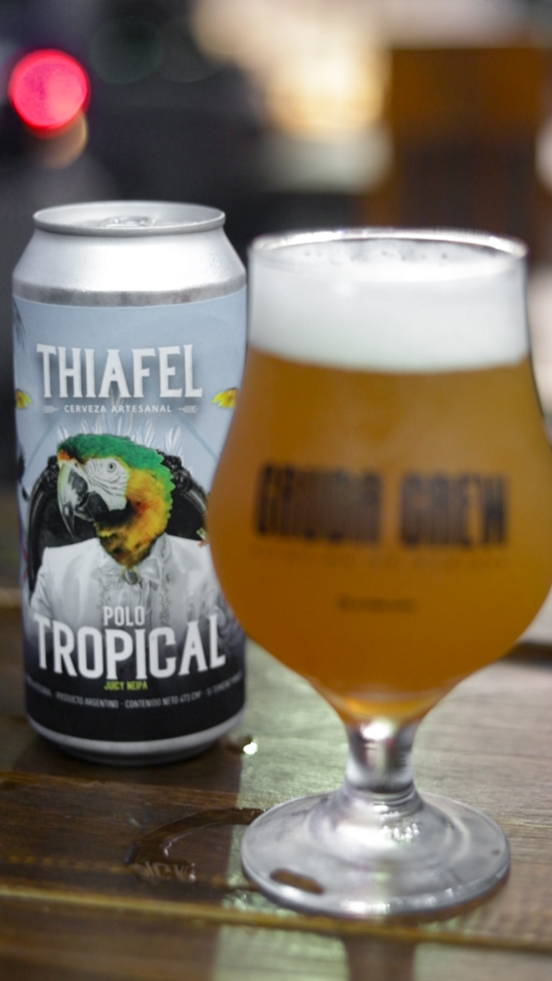
Same structure on all of them: an animal in a suit at the center, the variety name below and the spec sheet on the side panel.
What changes from one can to the next is the color, the landscape and the character. What never changes is where each thing sits: logo on top, portrait in the middle, big name below, and the side with alcohol, IBU, style and ingredients in the same hierarchy. Unfolded, the label is a single continuous scene wrapping the can.
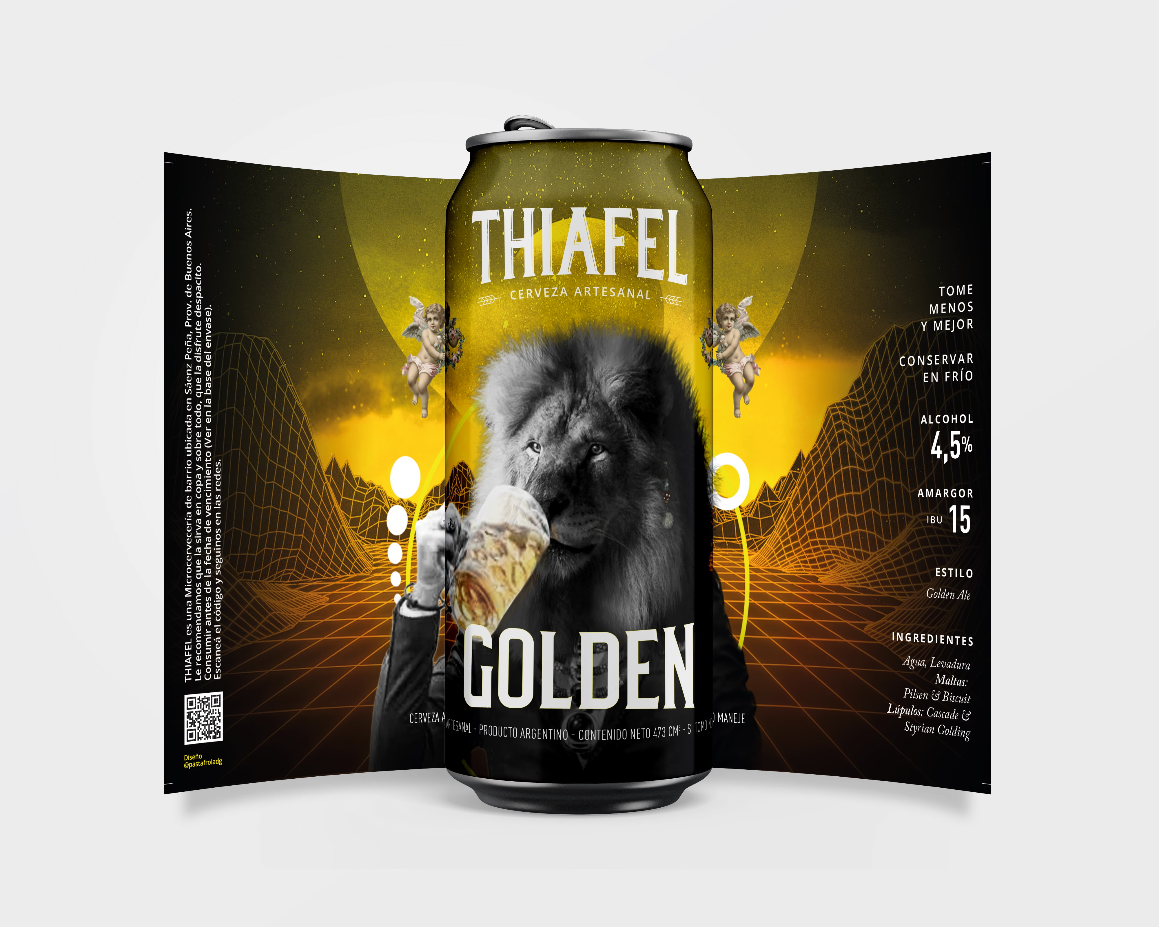
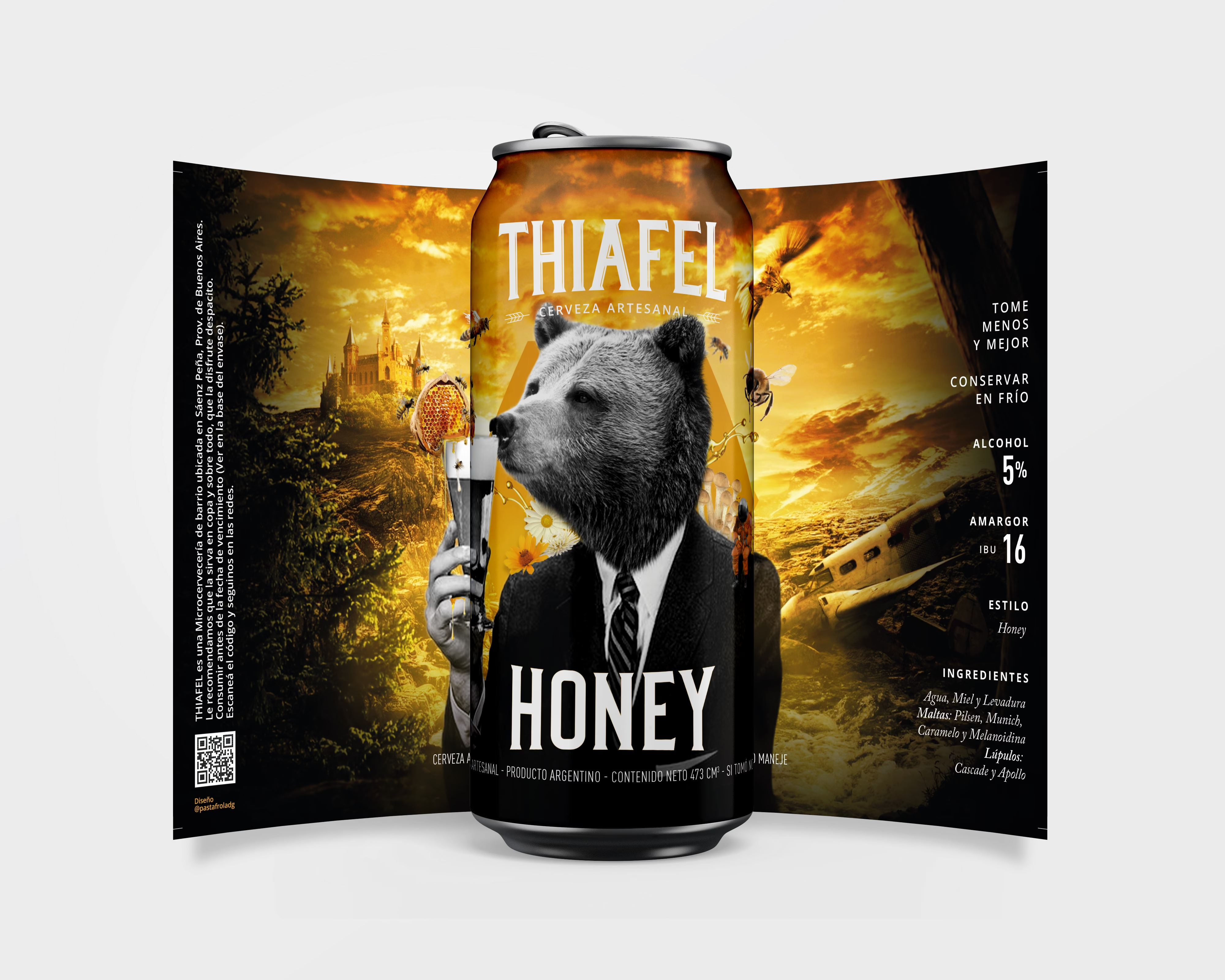
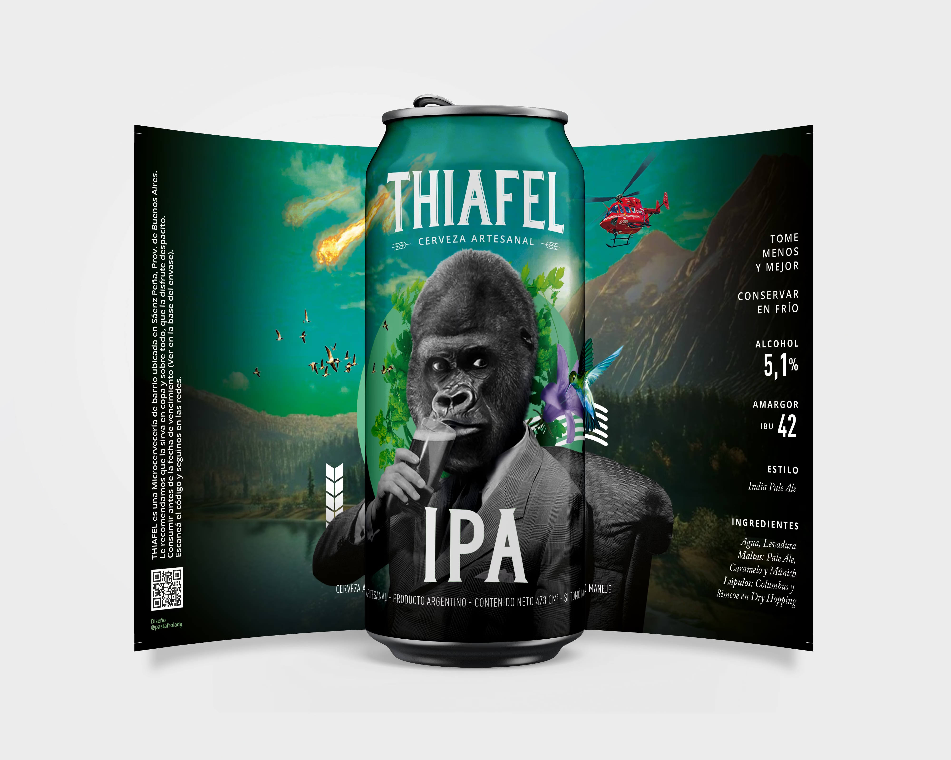
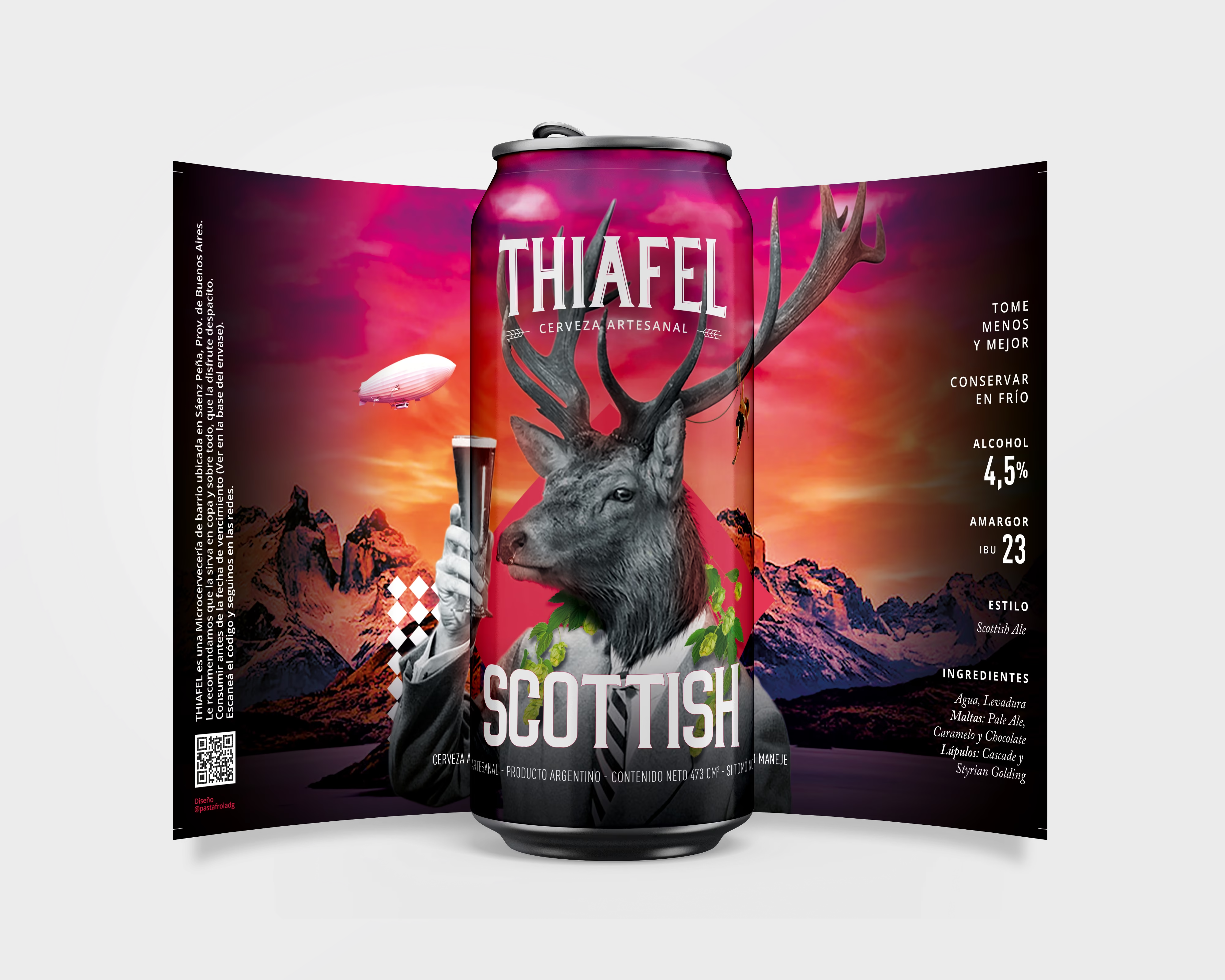
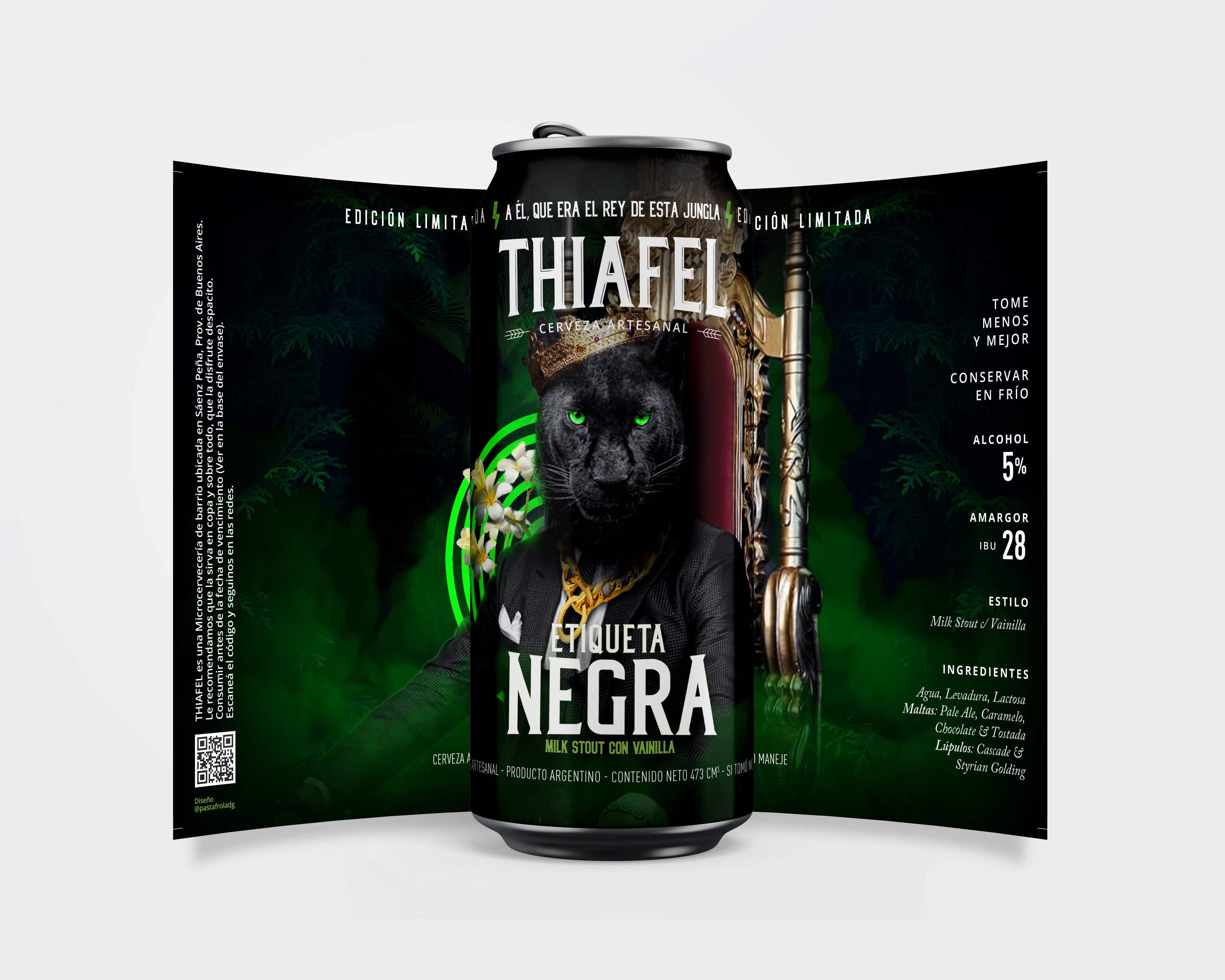
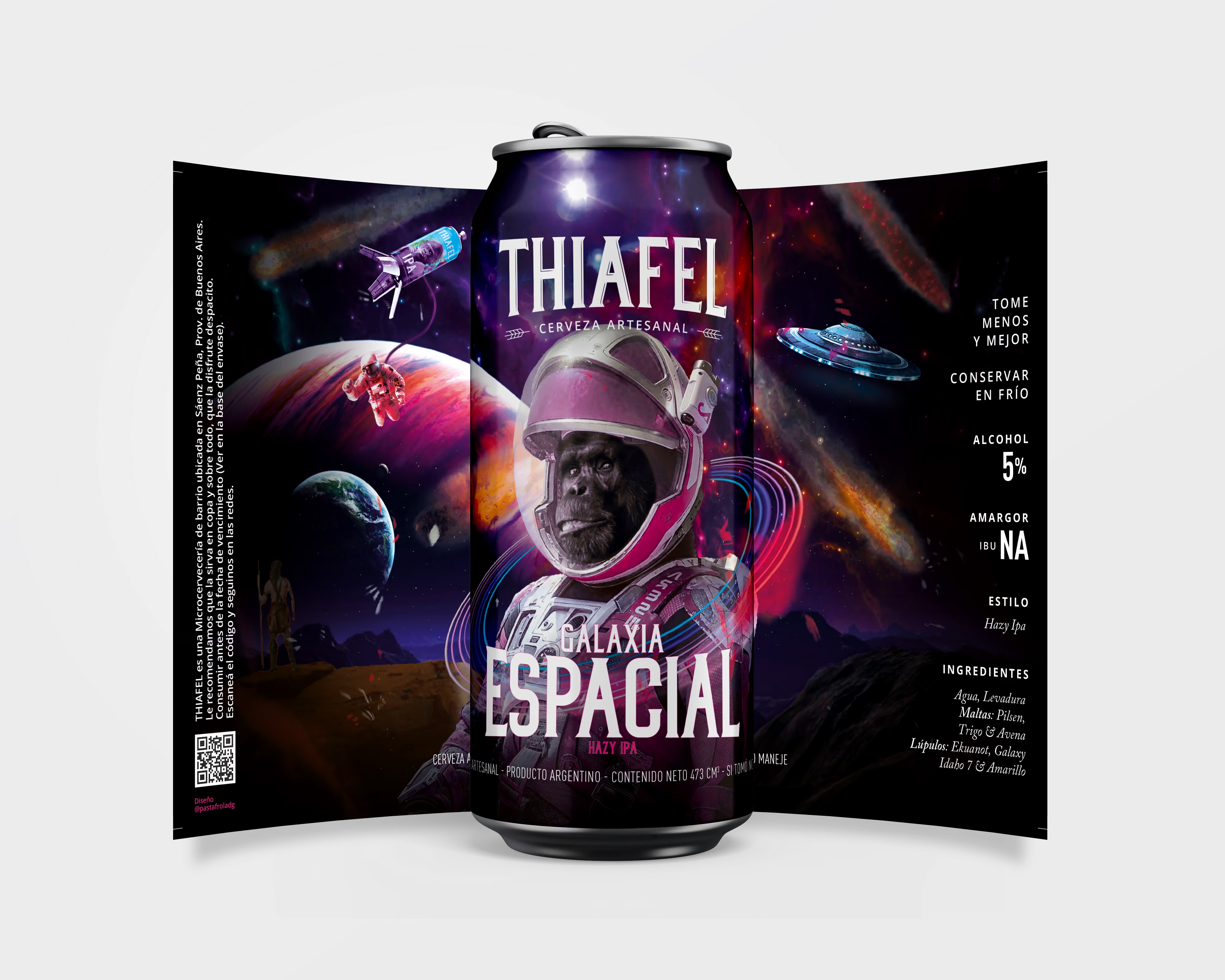
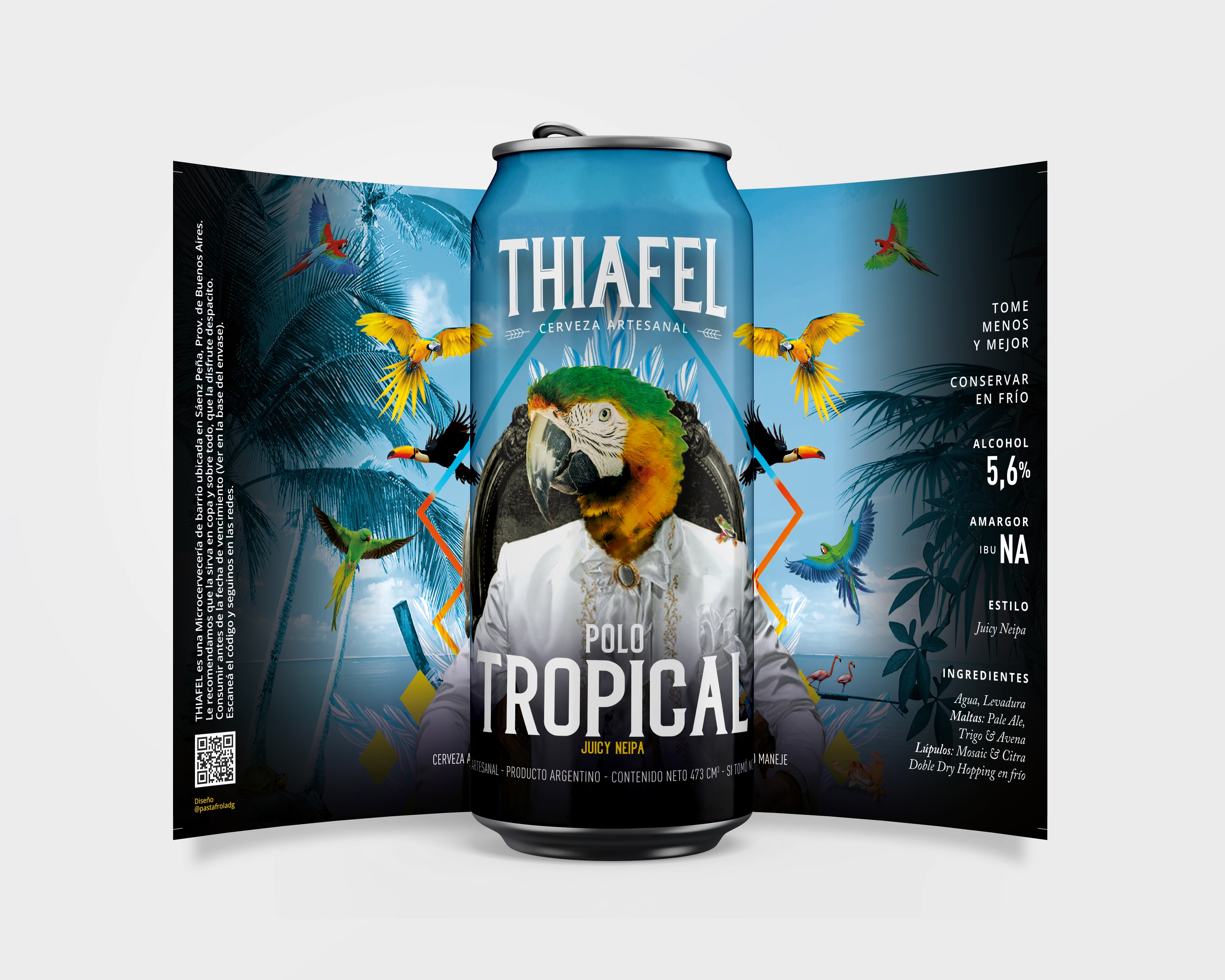
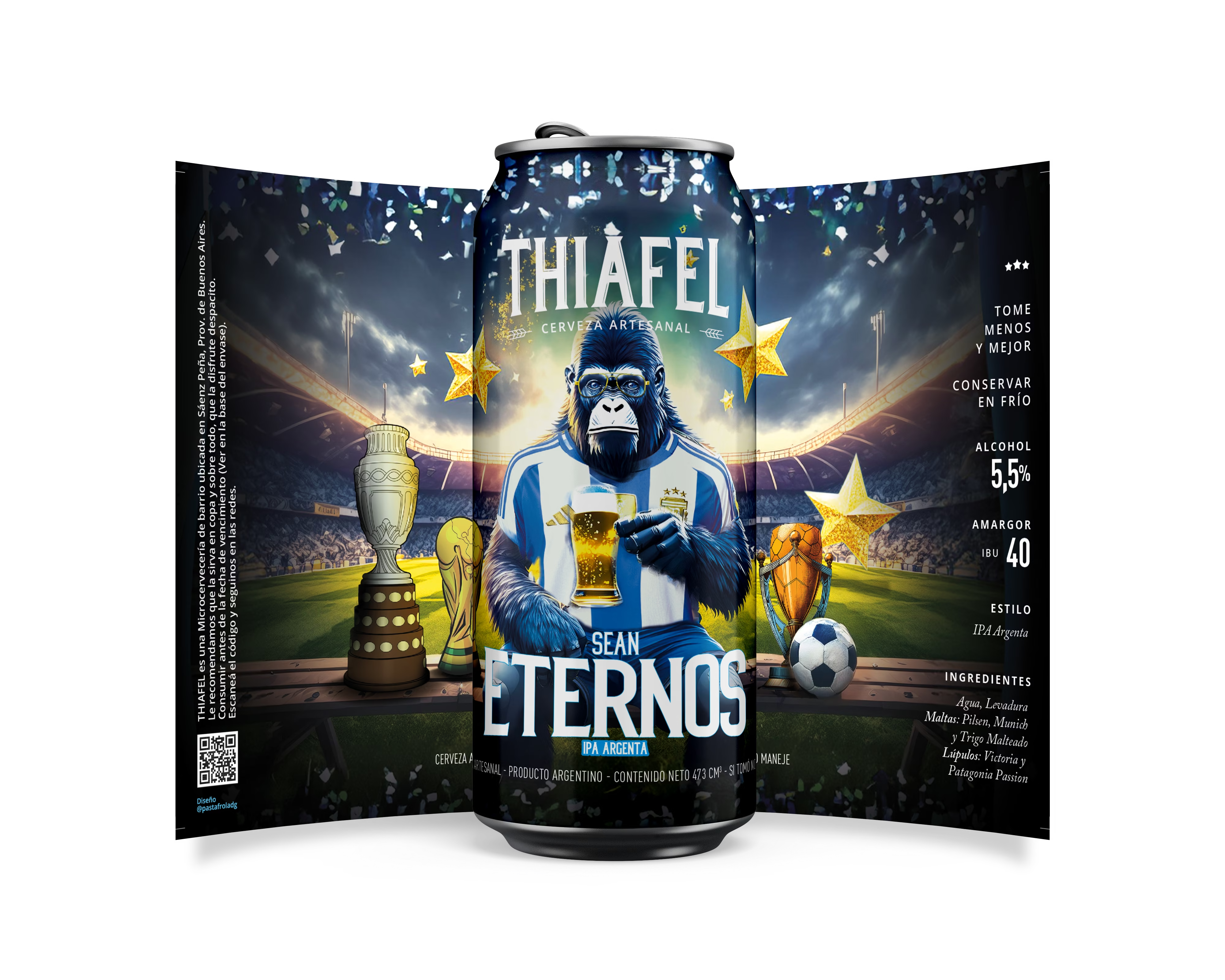
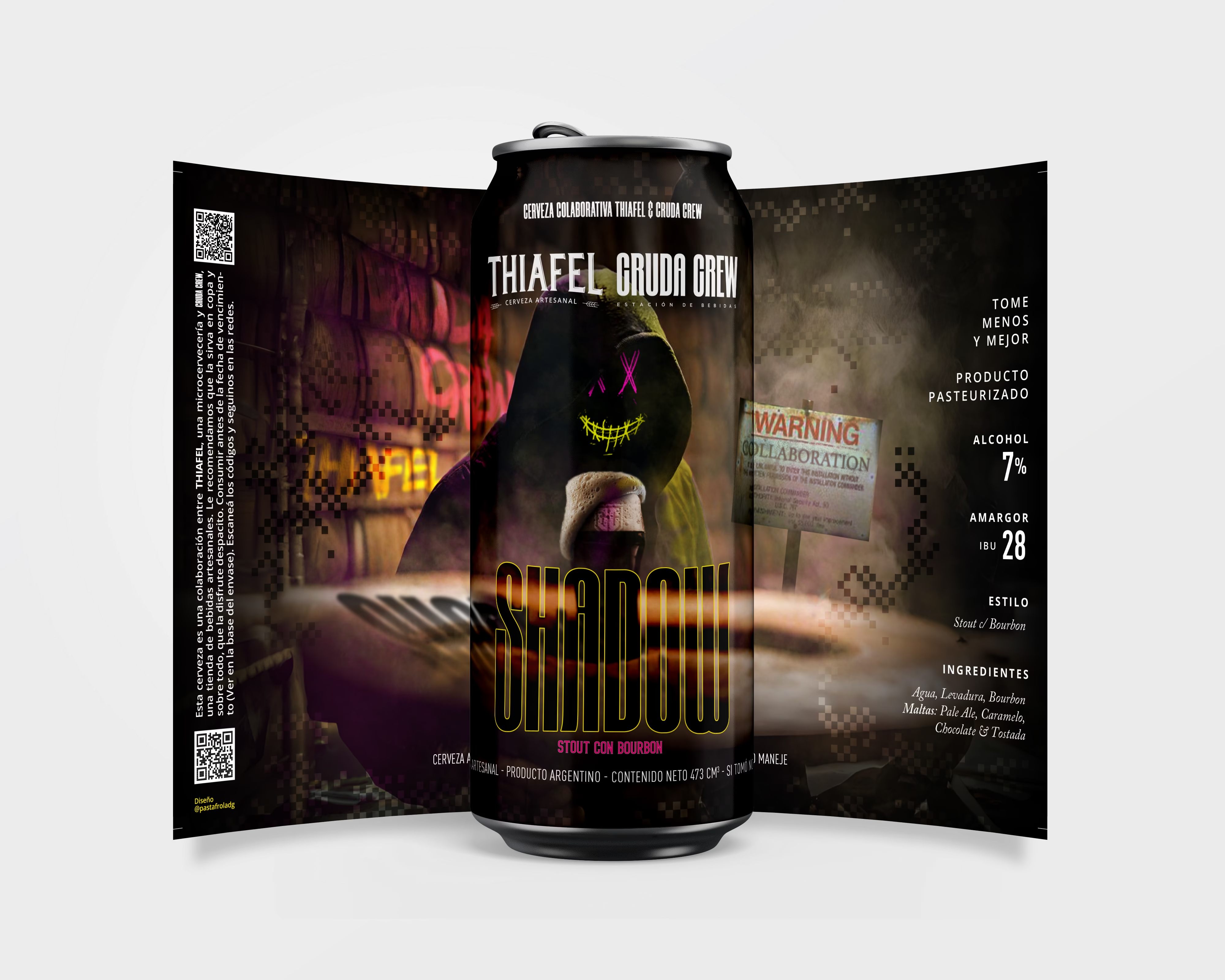
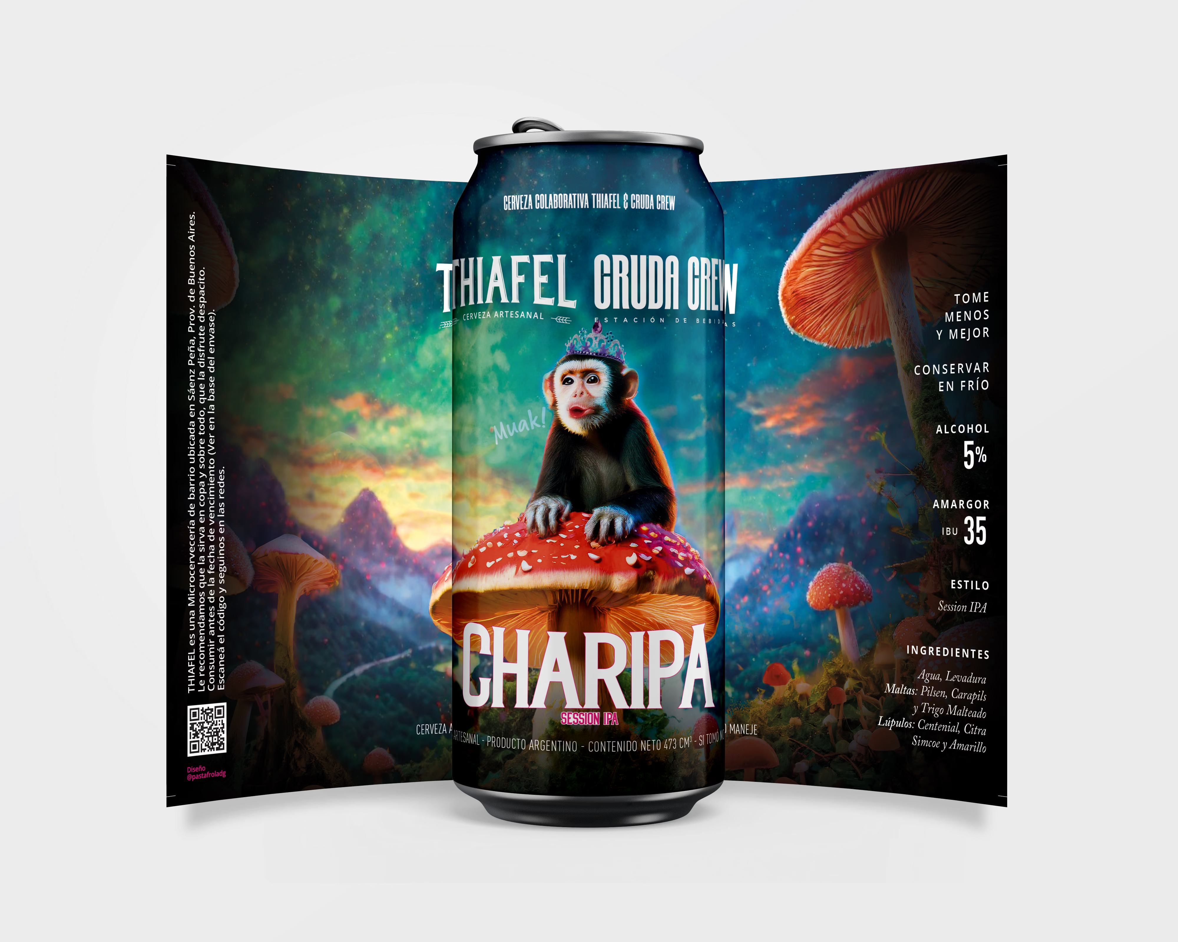
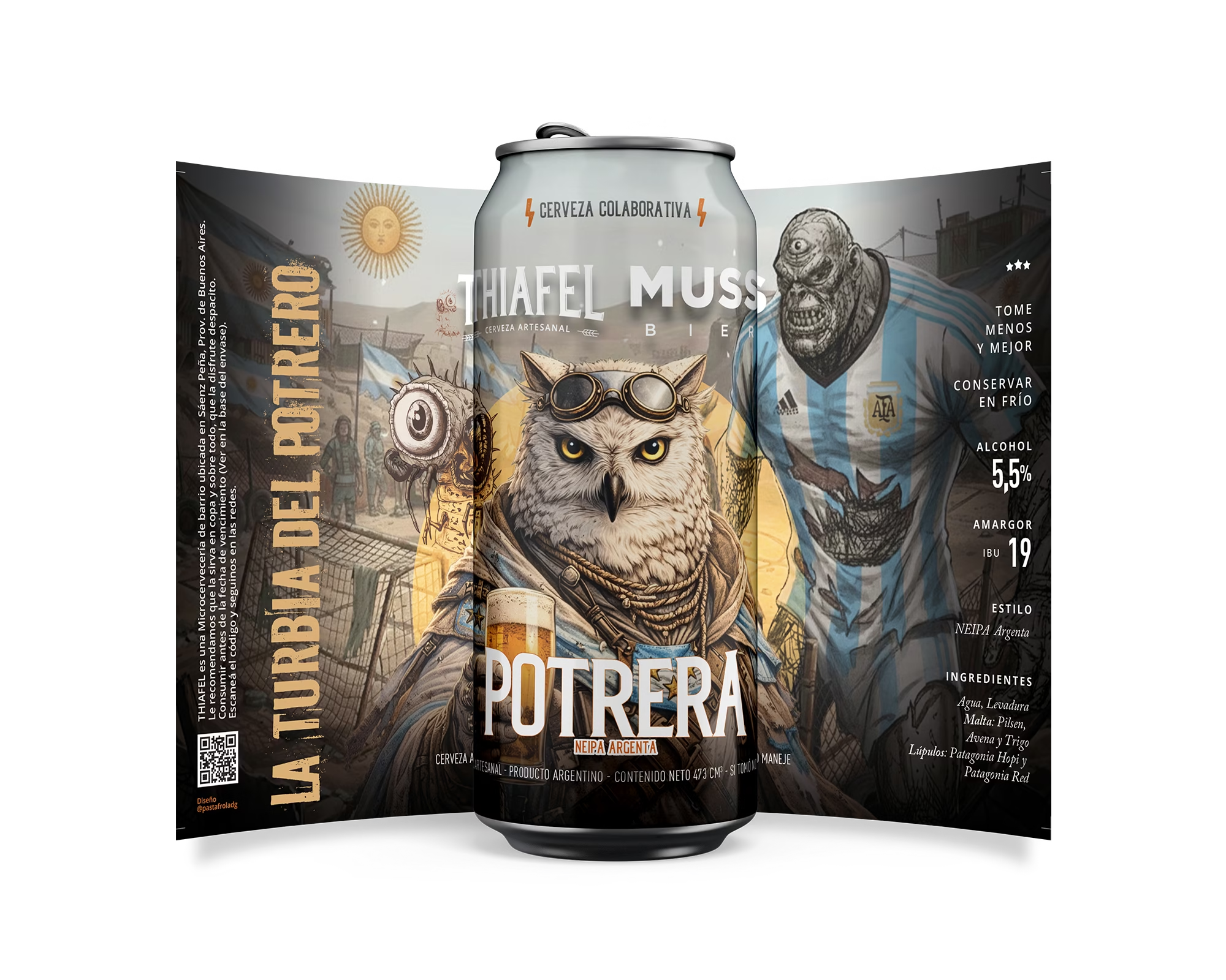
Eleven cans designed between 2020 and 2026. Together they read as a series; apart, each one has its own world.
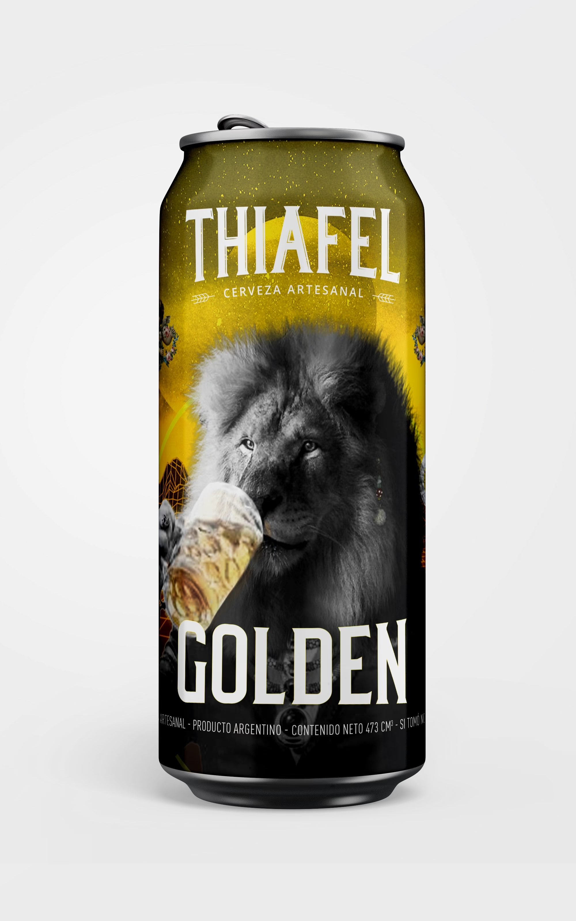
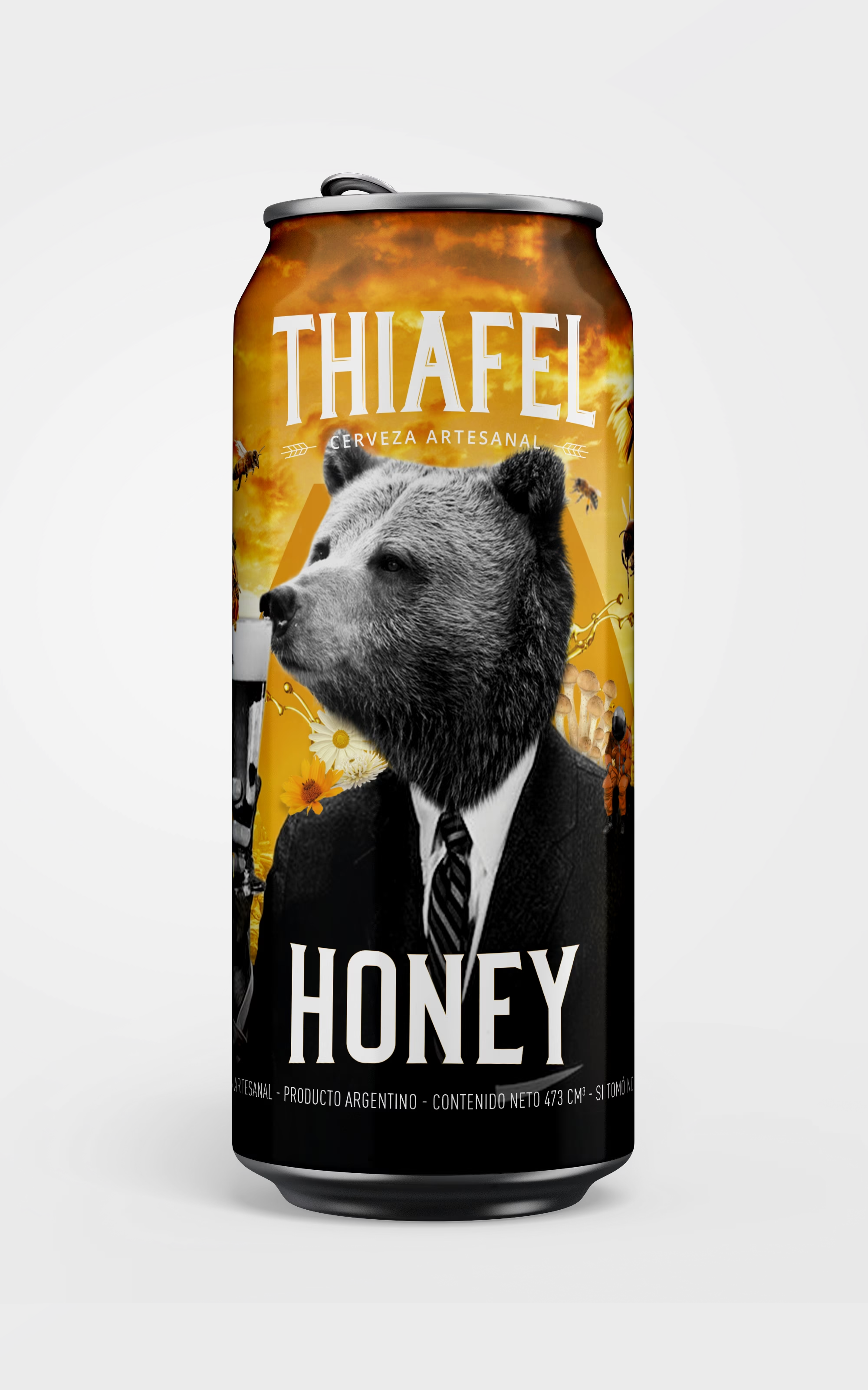
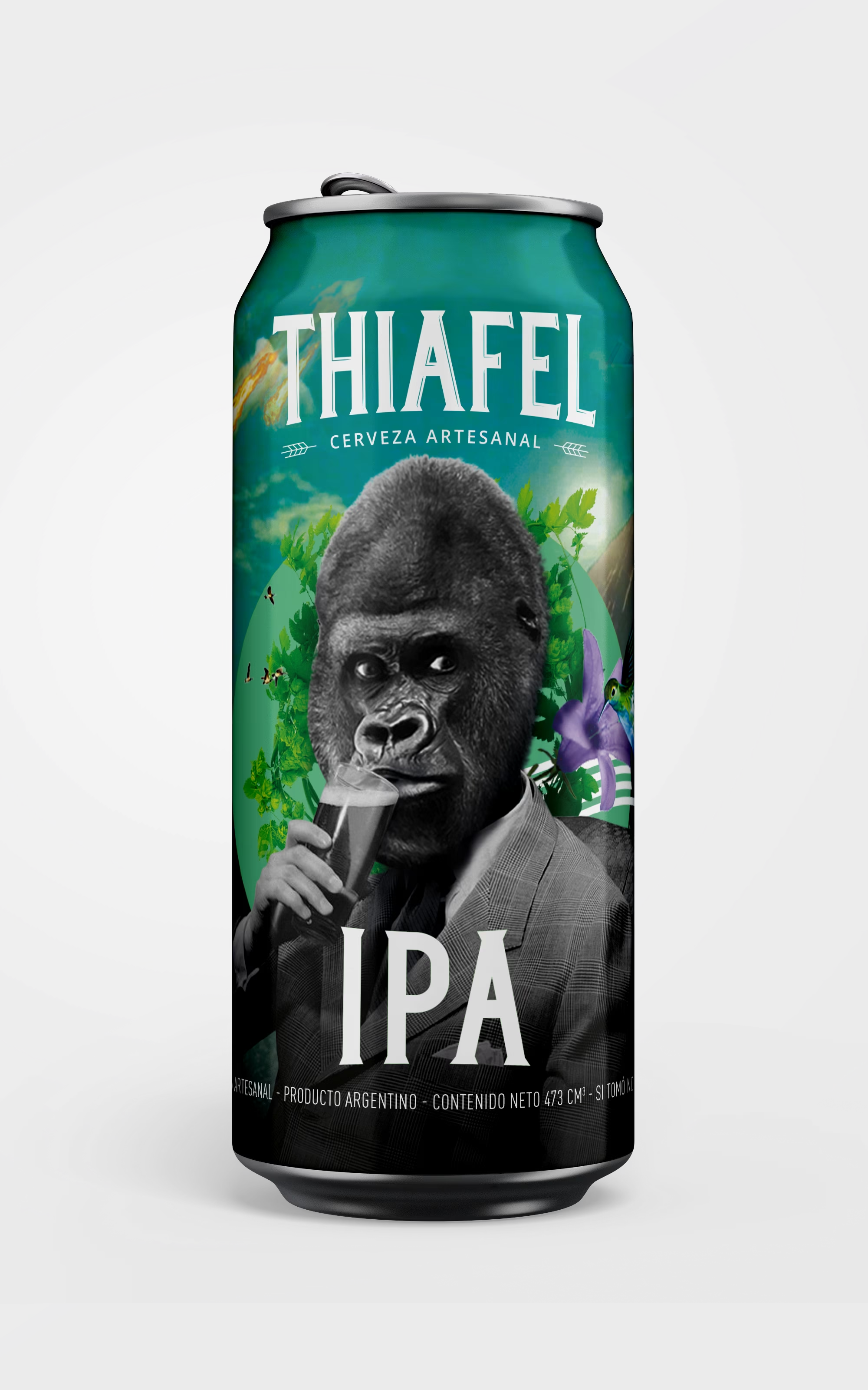
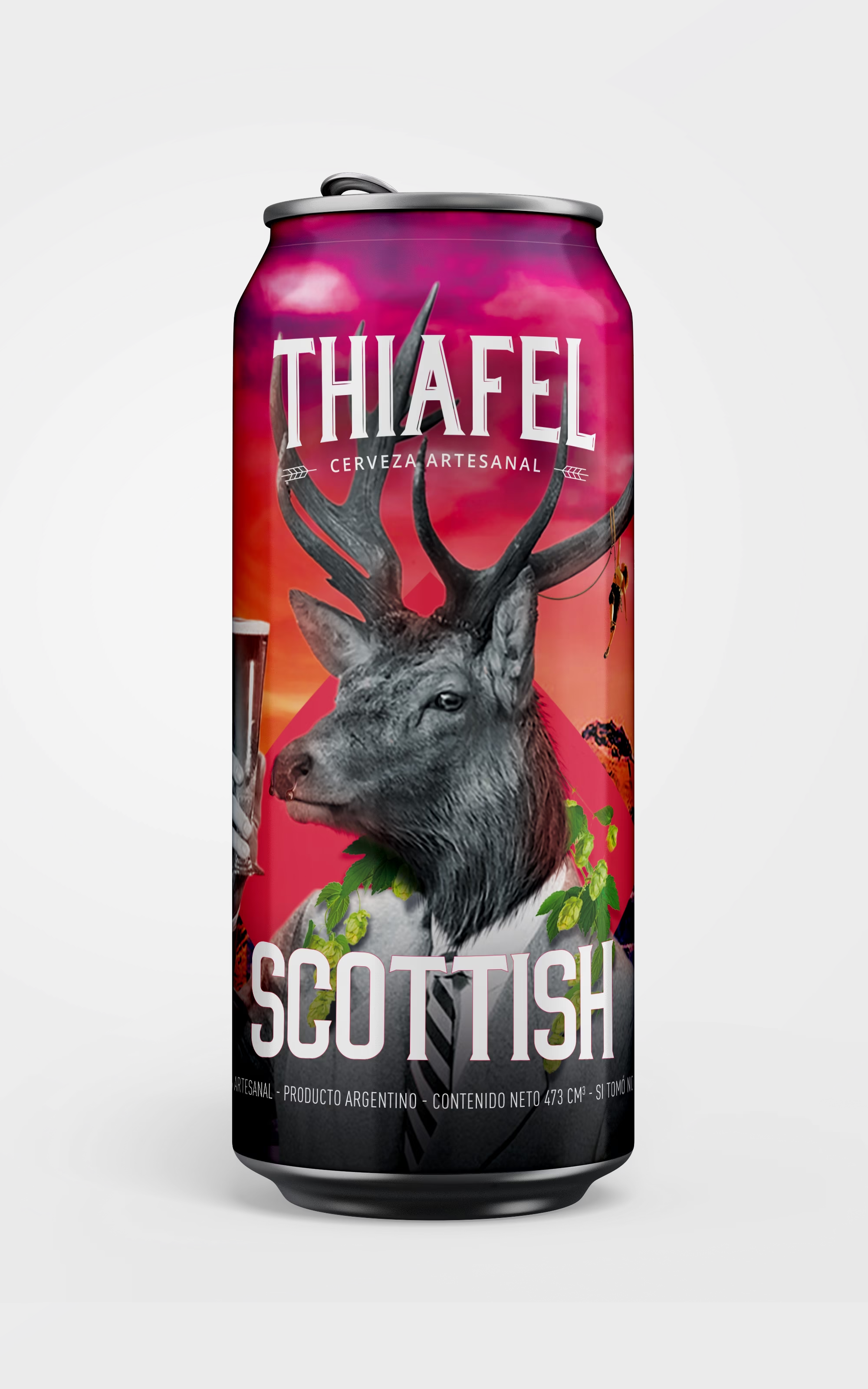
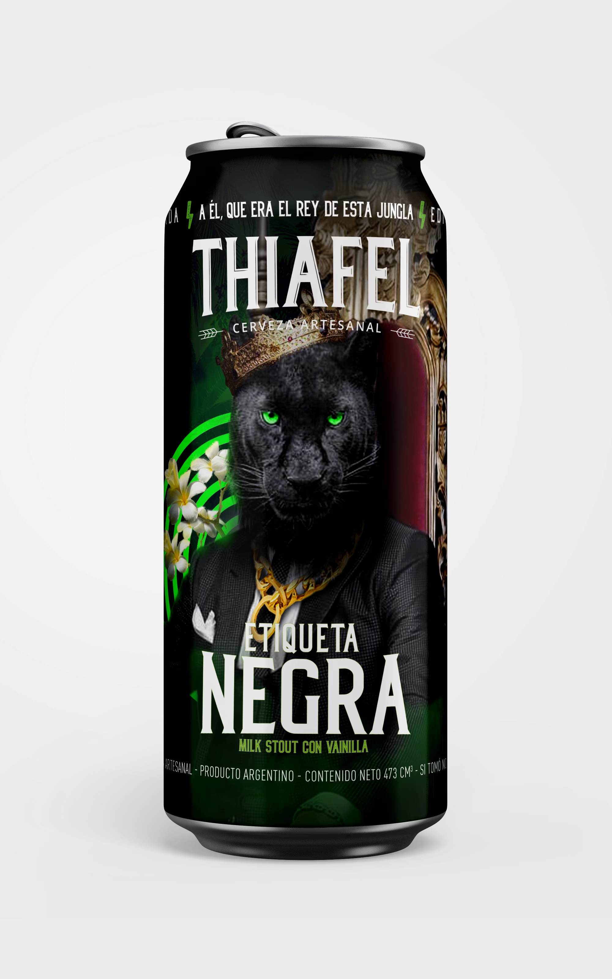
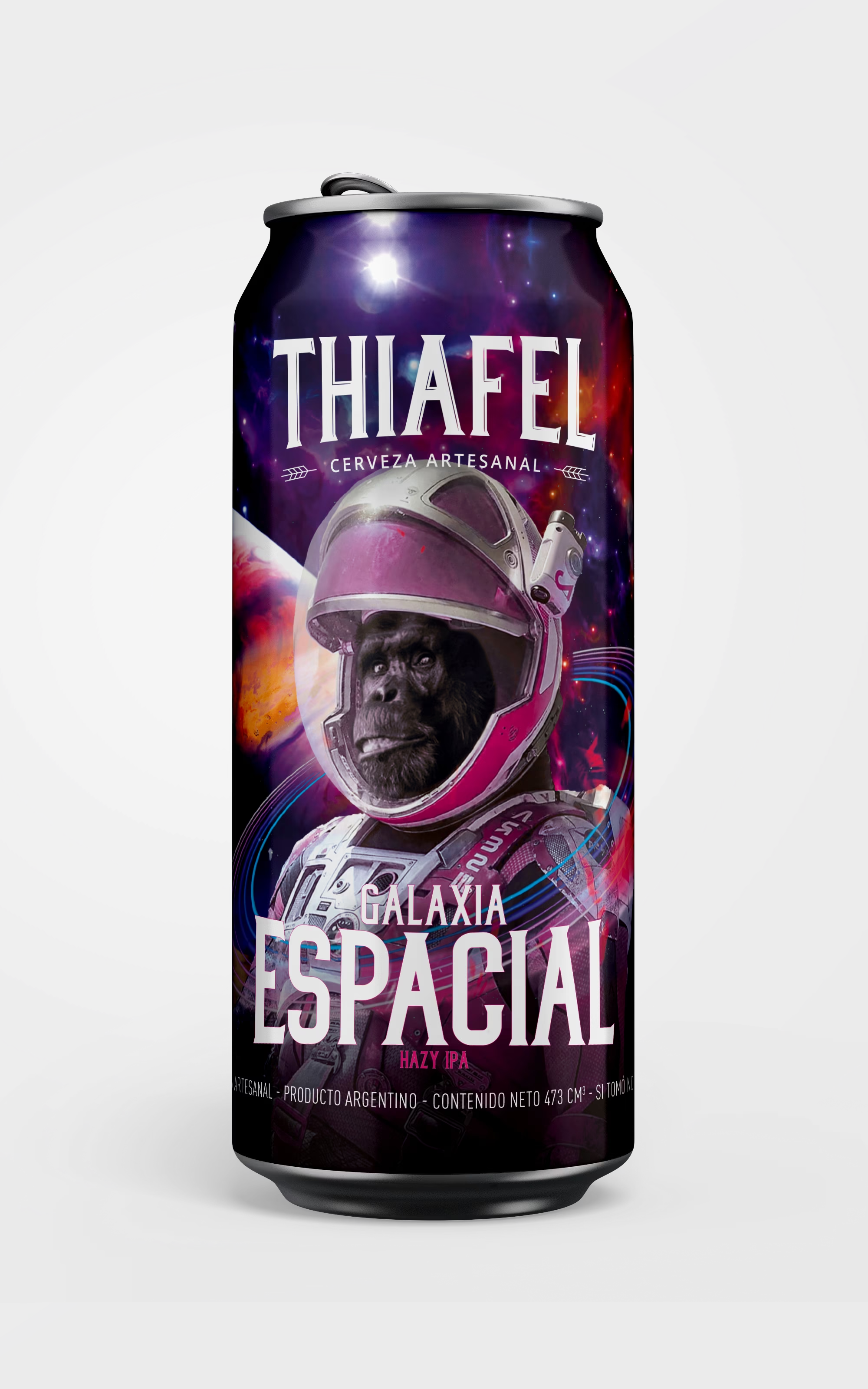
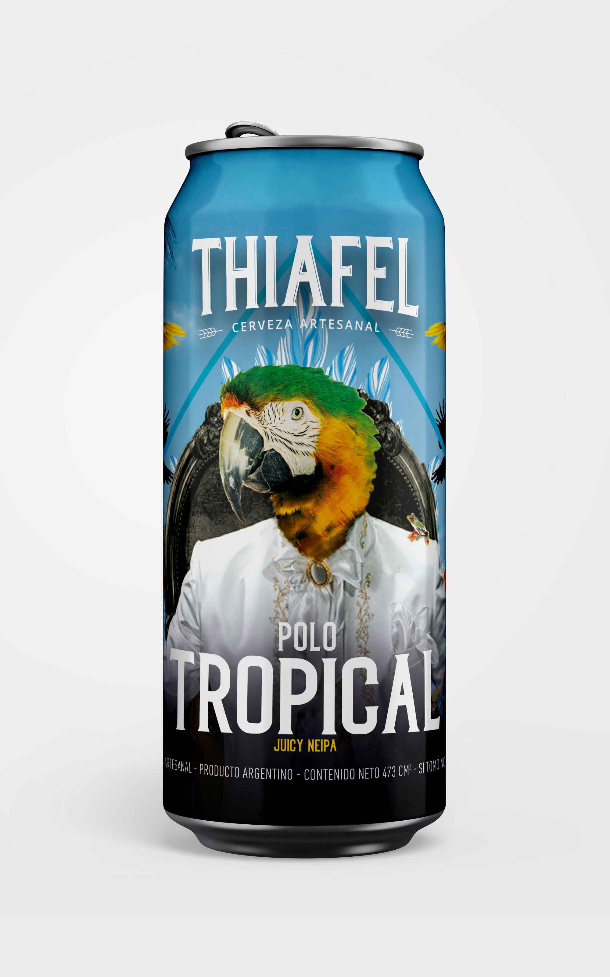
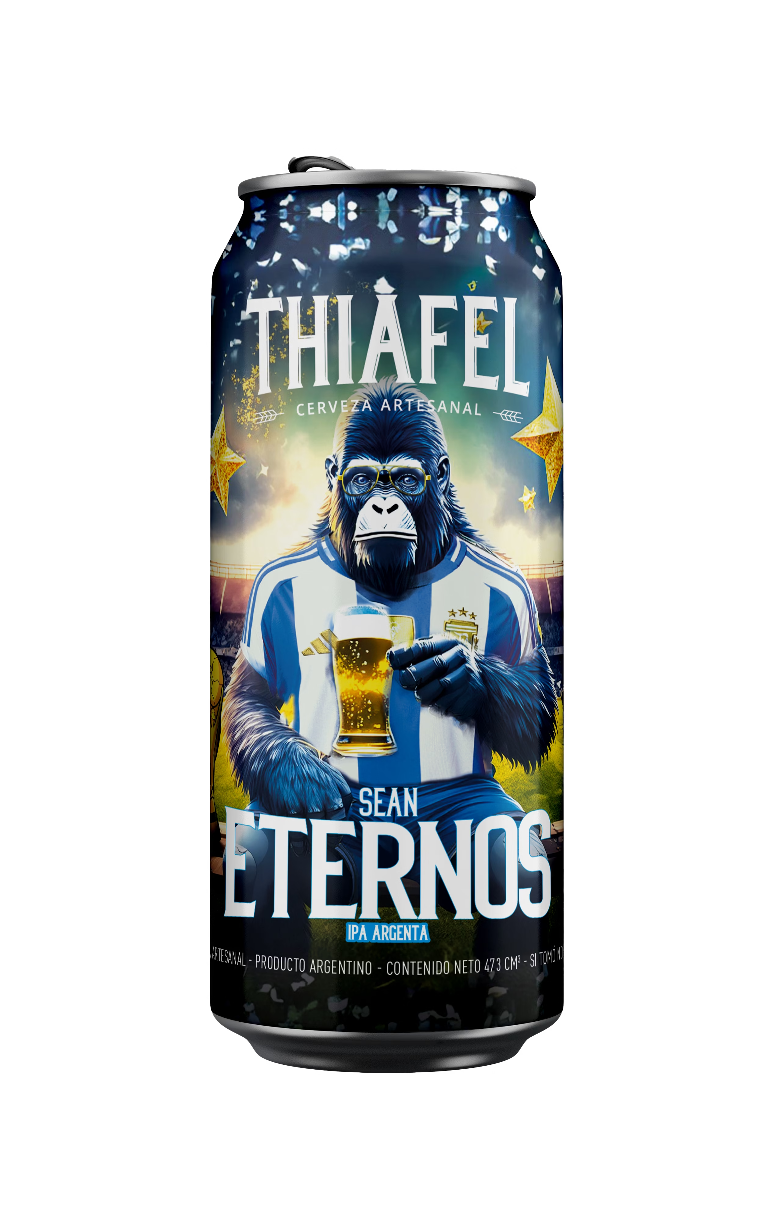
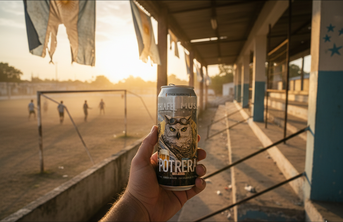
Three cans were made with other brands: Shadow and Charipa with Cruda Crew, Potrera with Muss Bier. There the front carries both signatures at equal weight and the system yields just enough —the name's typography changes so the can reads as a release of its own and not just another variety.
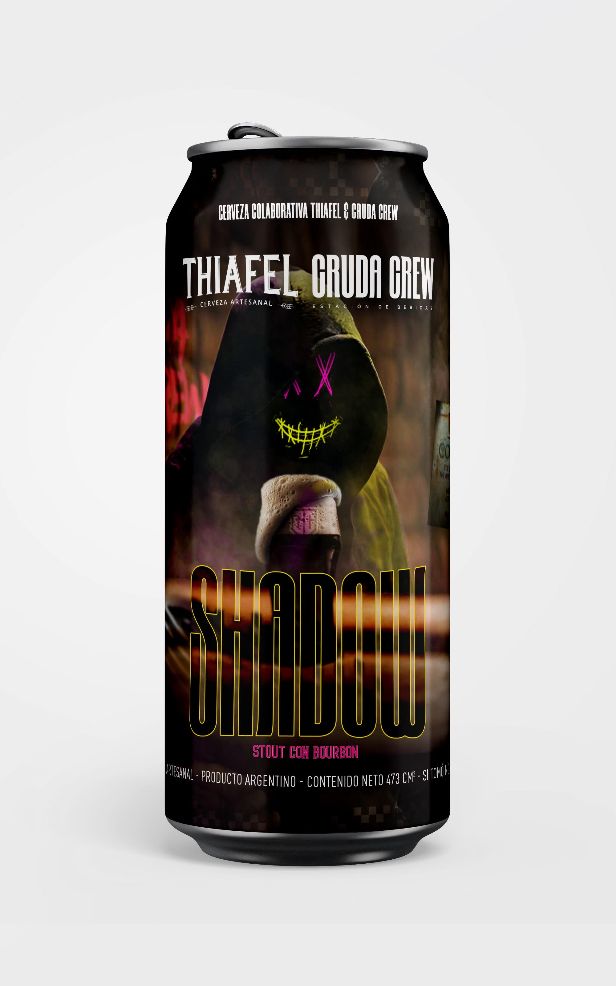
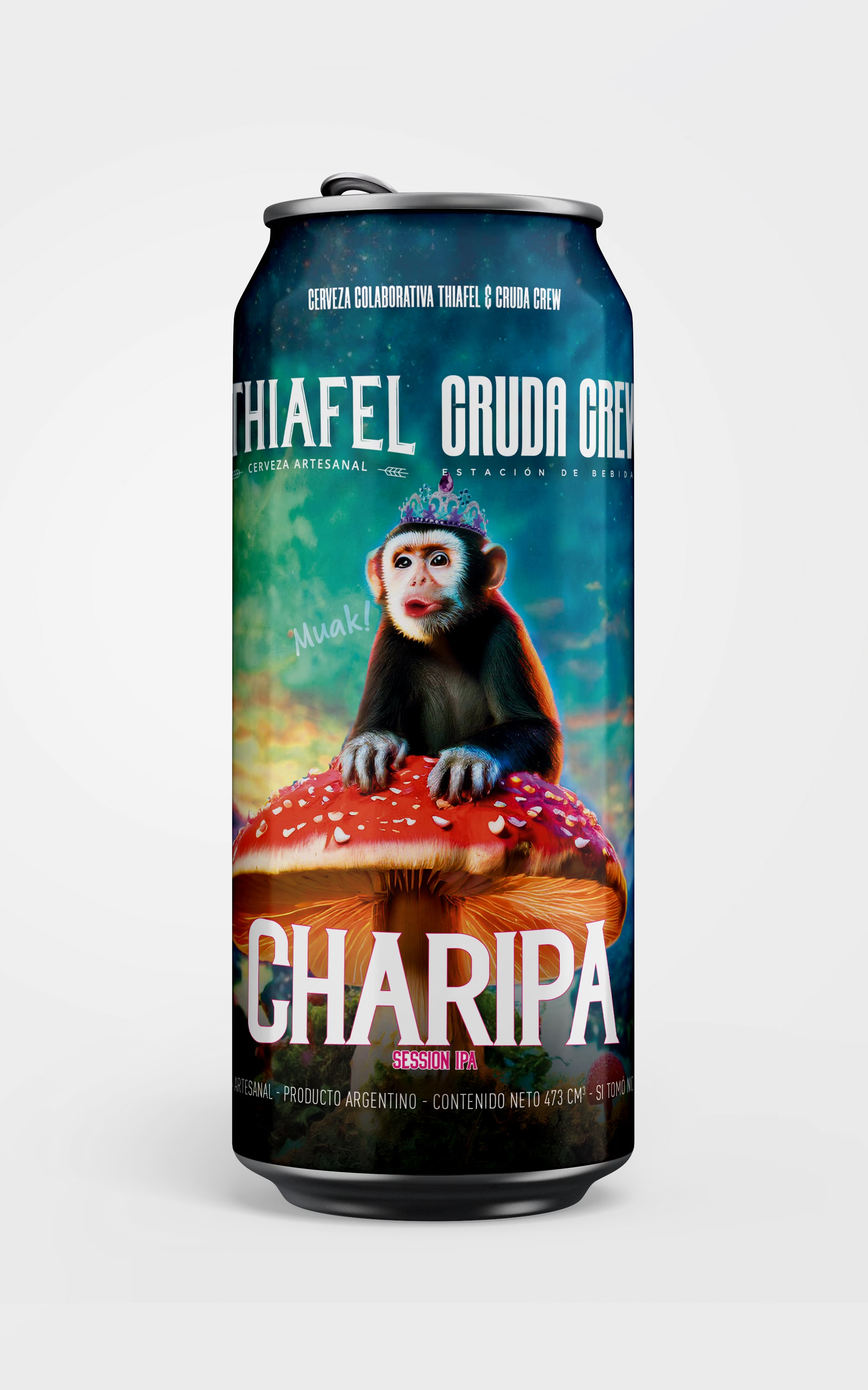
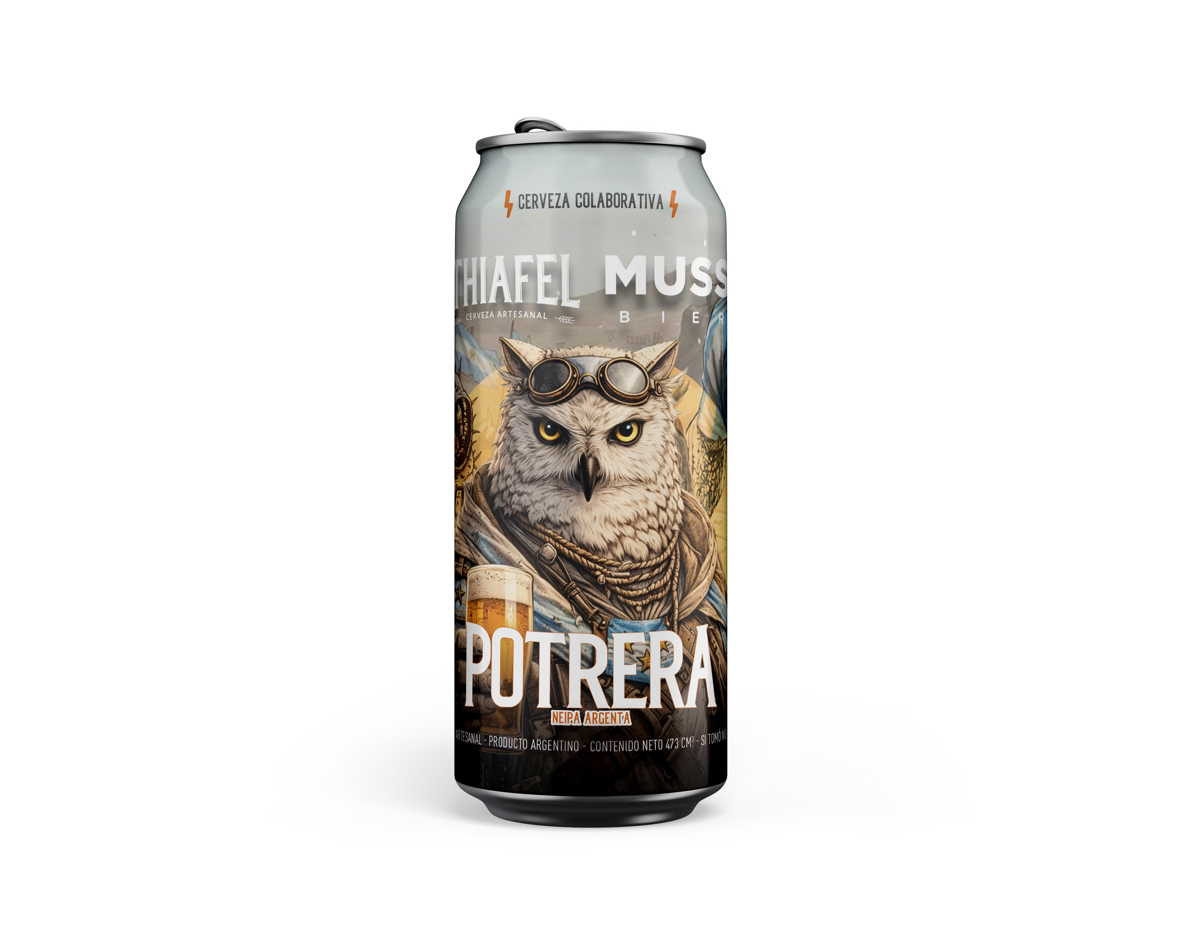
For social media, each release is photographed inside the world of its label. The communication piece doesn't explain the beer: it stages it.
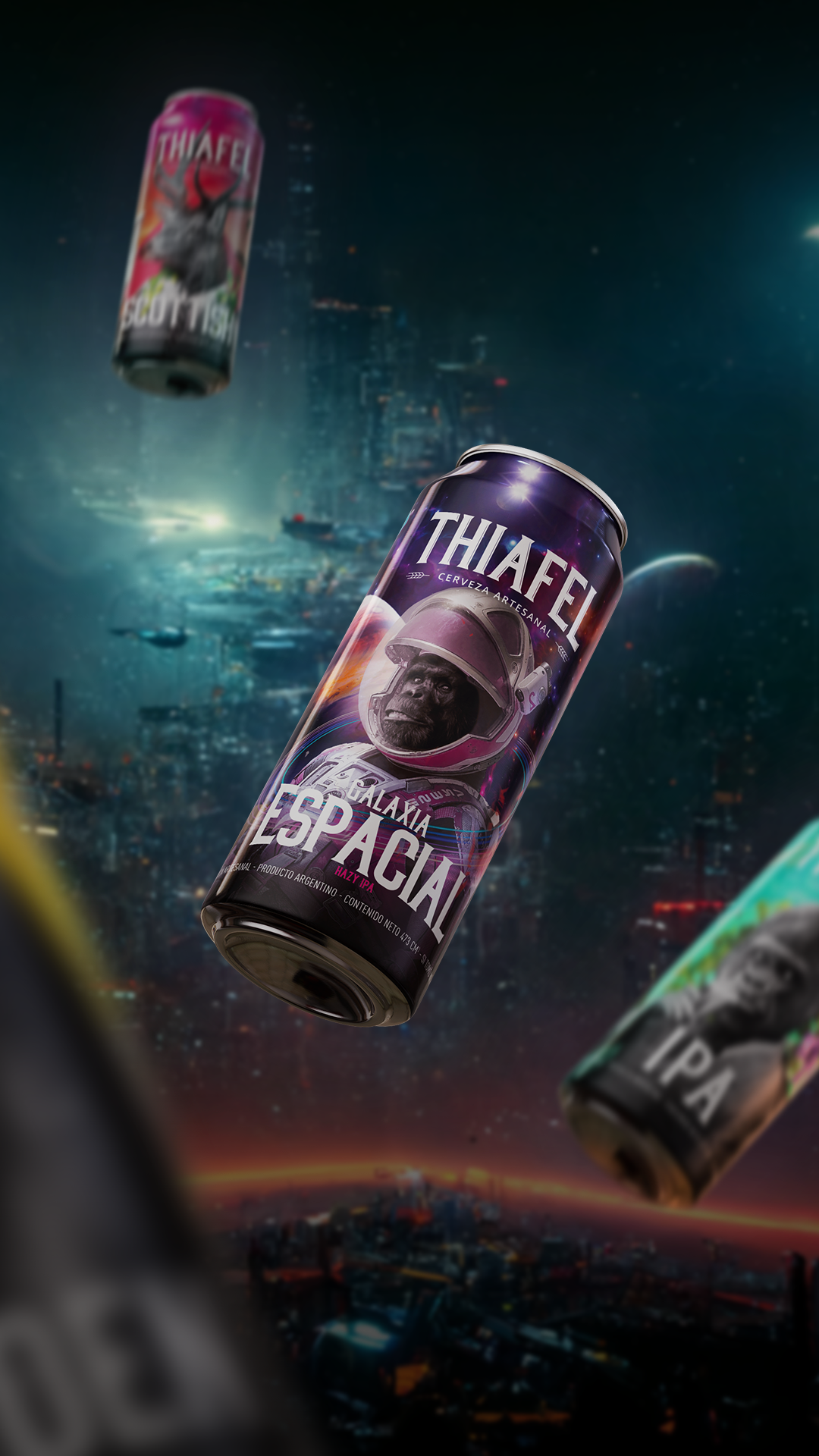
The real test is in a brewery's freezer or on a bar table, among twenty other people's labels and with whatever light there is.
A system is tested with release number eleven, not with the first.
The brand manual here was short and stayed in the logo. What sustained the identity for six years was a packaging decision: fix the structure and leave each variety's world free. Every new beer could be different without negotiating anything, because what makes it Thiafel isn't the color: it's where each thing sits.